Depth and Space in Drawing and Composition….
view the Youtube timelapse VIDEO BELOW!!!
I love sketching Brazilian Carnaval from the Northeast (Salvador, Bahia, and Recife, Pernambuco)….The “carnaval de rua”, street carnaval, is so colorful, with drumming and costumes, singing and dancing…Every January in NYC, it’s my big escape from winter to celebrate decoration and adornment by sketching the brilliant colors and vivid costumes and vivid life of carnaval.
SKETCHING FASHION, COSTUME AND ADORNMENT IS MY PASSION! Today I’m going to talk to you about
Depth and Space in Drawing and Composition
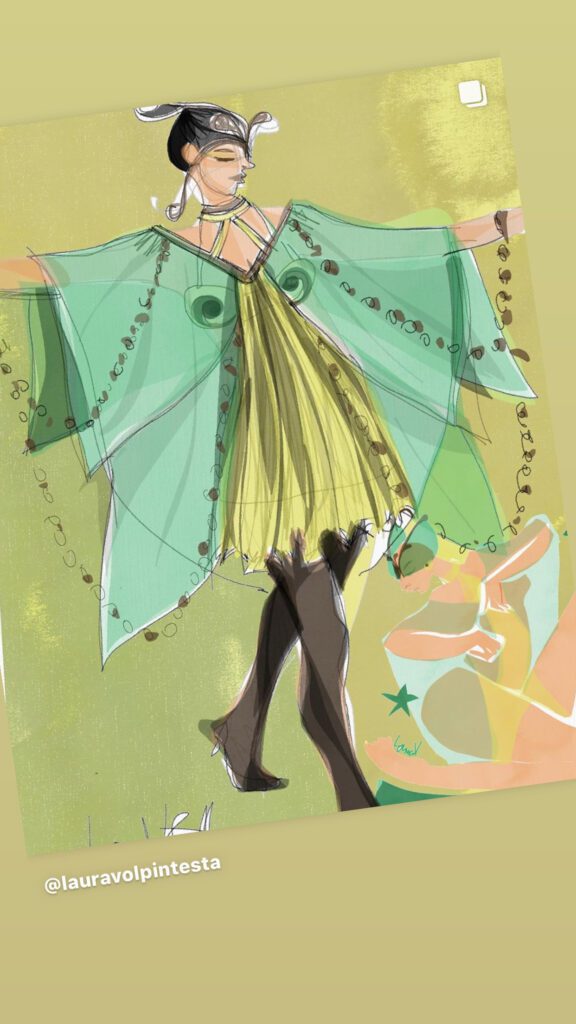
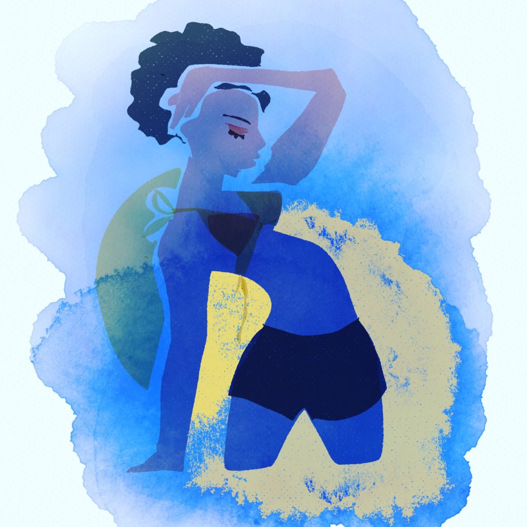
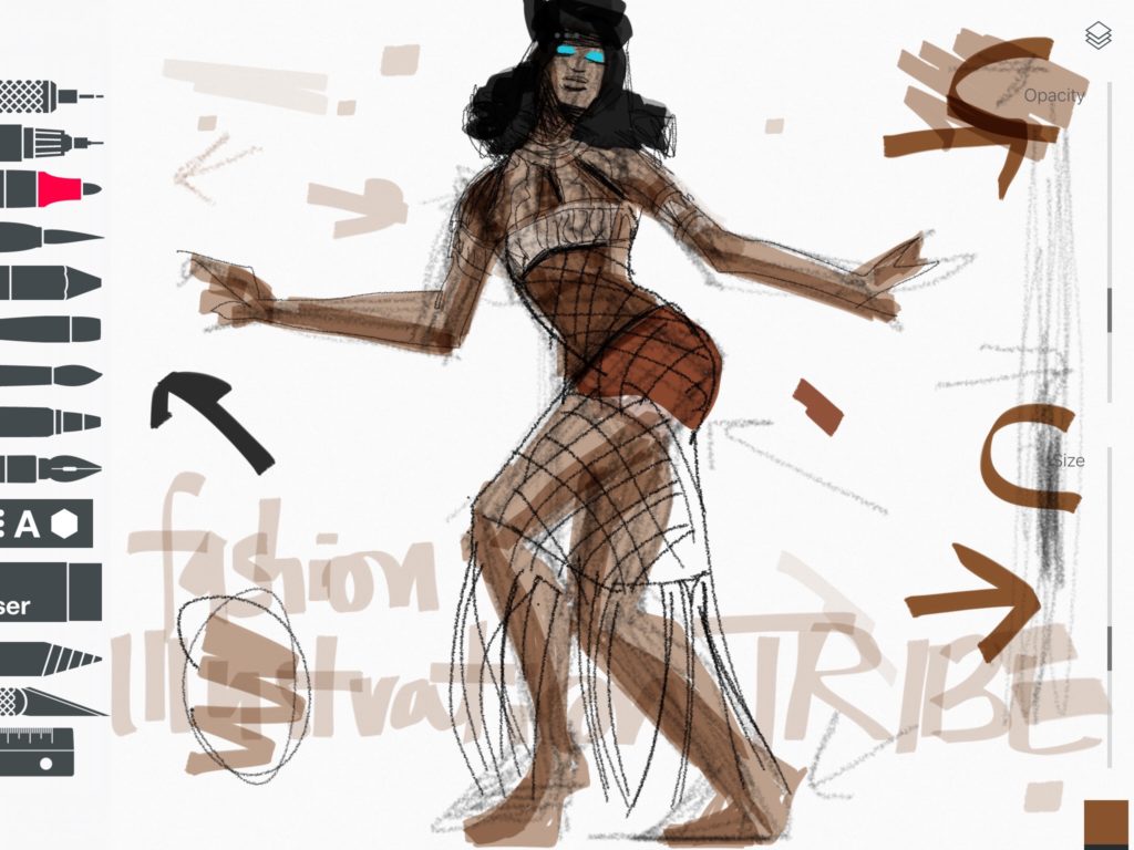
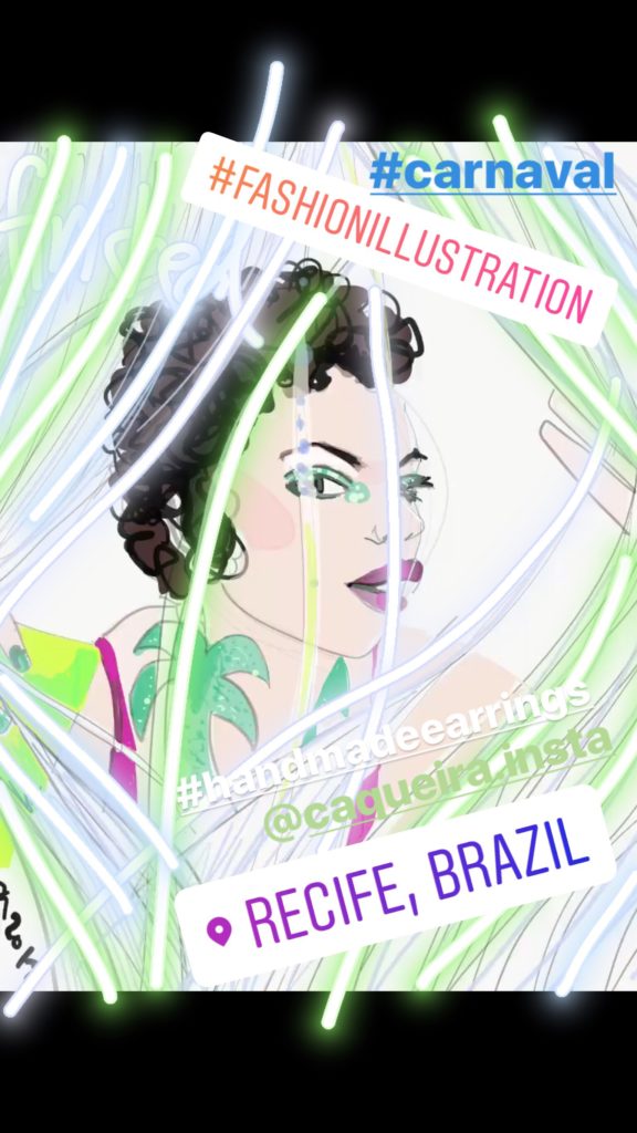
Using this piece as an example, I’ll explain to you what’s “going on” in this fashion illustration that I created using Adobe Draw App- now called Adobe Fresco. (Plus special effects and stickers from Instagram stories).
It looks so simple, but any drawing can take on new meaning when you get “new eyes.” We’re going to look at all the ways that depth and space are created through principles of Drawing and Composition, because whether you do it consciously or not, you’re doing it. . The key is that if you gain the consciousness, then you can use the tool more deliberately to create dynamic illusions of depth on any 2D drawing surface!
 What we’re focusing on in this is the sense of space from front to back.
To notice the LAYERS OF SPACE.
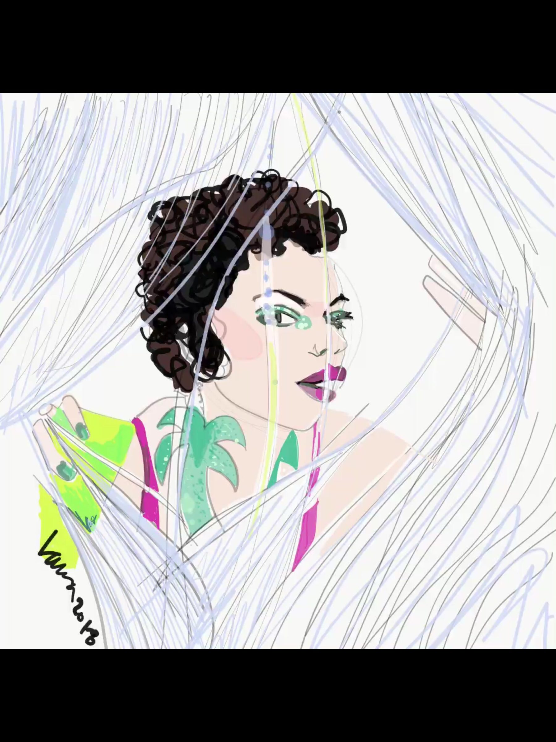
Look at the image above (the images below are more about showing you a step-by-step drawing process).
Drawing is TWO DIMENSIONAL. It happens on a flat surface. But the ILLUSIONS you create in drawing and composition are THREE DIMENSIONAL.
(You can learn more about Drawing and Composition in one of the modules my newest Digital Course “FASHION DESIGN INFUSION“- for example, how to emphasize the layers of garments in an outfit)
One if the amazing ways to create SPACE,…
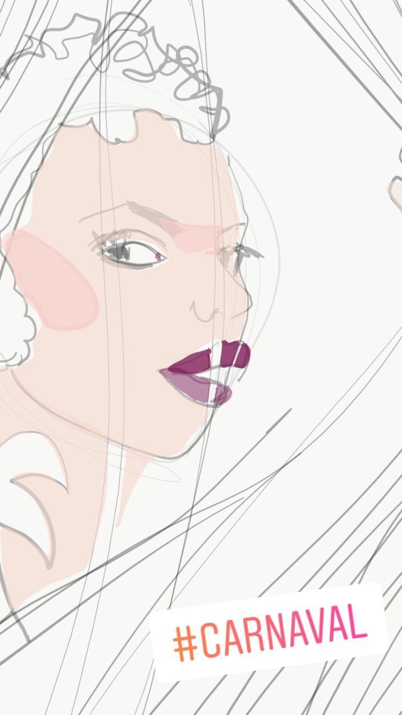
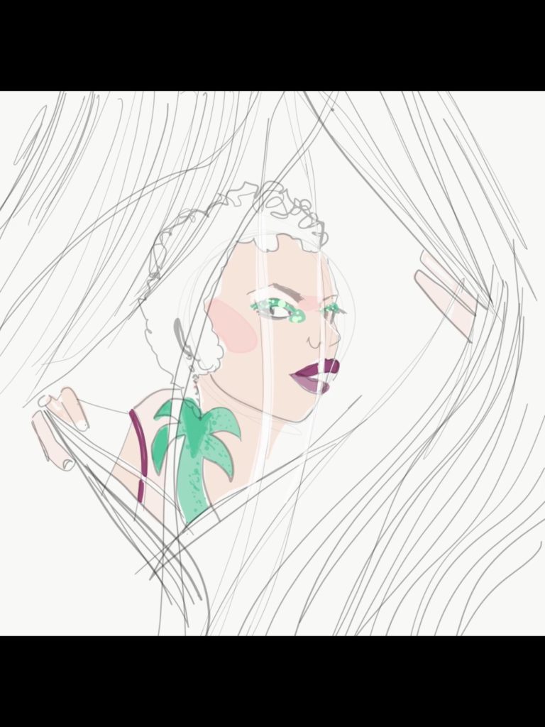 is through “overlapping” and “interruption” (which are very much the same thing). The woman you see above is “behind” the ribbon curtain, as the whole, continuous shape of her face (empasized by the unifying color of the entire face) is interrupted and overlapped by the white ribbon.
But if you look look at the next image, you’ll see the difference…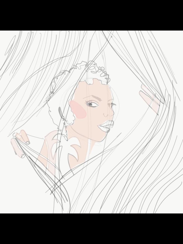 I drew her simply as her face. I drew ribbons over her face, but there is no impact because they slightly overlap and interrupt, the face, but not nearly as crisply and clearly as when the ribbon was white and masked the skin tone. BIG DIFFERENCE RIGHT?
This is a major Drawing and Composition tool! Her hair overlaps her face, but this becomes more obvious above when color comes in to separate forms into separate colors, right?)
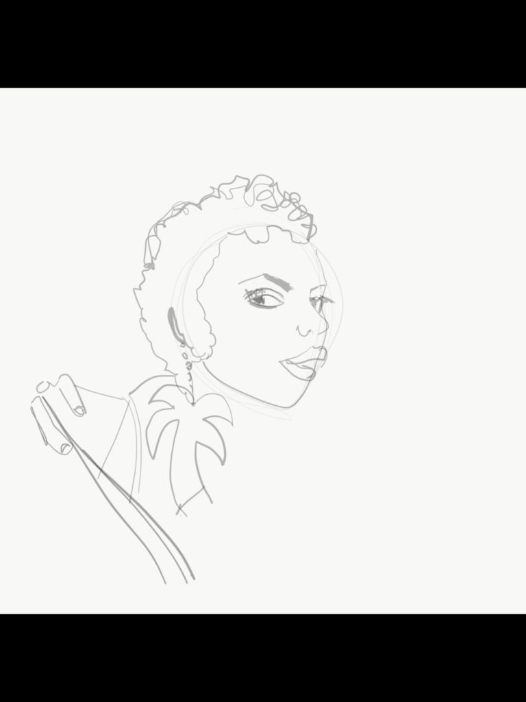
- Also, notice how her EARRING is IN FRONT of her neck. How her NOSE is “INTERRUPTING” her eye (at the right)
- Even her EYELID is OVERLAPPING the iris of her eye, which cognitively we recognize as a full circle, but we only see a piece of it BECAUSE of the overlap, right?
- And her lips: we know what lips look like from the front- here one side of the mouth eclipses the other, TELLING us that she is in rotation.
 AFTER I created all of that,
I added in the curtain of ribbons OVER my original drawing. This created a very deep sense of layering as well. Here you can see a zoomed in vision of the “pencil drawing” process so you can “backtrack ” with me to see how I got the three dimensional effects in my drawing and composition.
A good exercise for you
is to look and ask yourself “how many layers of overlaps are in this image?” before making a fashion illustration. Even when working purely from imagination, you always have the option to use frames or backdrops that provide depth, as well as shadows, overlaps, and interruptions, in so many areas of your drawing and composition.
And notice how much depth of space this creates in our minds, even though we worked on a flat surface: a sheet of paper or in this case, an Ipad screen. We created depth and space in our drawing.
Looking at it now, I keep thinking
how I could have created a colored or black background behind the model to make even more contrast in layers, since so far this sketch has white background AND white ribbons, the sense of depth is diminished. RIGHT?
Imagine if the ribbons stayed white and the background were hot pink…. BIG DIFFERENCE, you can feel it in your body before you even see it, just to think of it. To me, this is the MAGIC and joy of drawing and composition, color and design theory.
Check out my courses, resources, and/ or consider coaching privately with me and really see your work take on new levels of meaning, definition and dynamic. And above all? Enjoy yourself and your process ,your journey, even more. That’s what I’m here for.
Love you!
Here’s your video timelapse process!
I hope you love it. Please like, comment, share, subscribe, let me know what helps you!
Love
Laura


