My first book is “the Language of Fashion Design, 26 Principles every Fashion Designer should know”. Today’s post includes rich video lectures about fashion, and below each video has fashion design sketchbook and design journalling exercises for you to act on RIGHT NOW to build your fashion design portfolio!
I gave a series of livestream talks about some of the chapters, which you can view the replays here for free for a limited time.
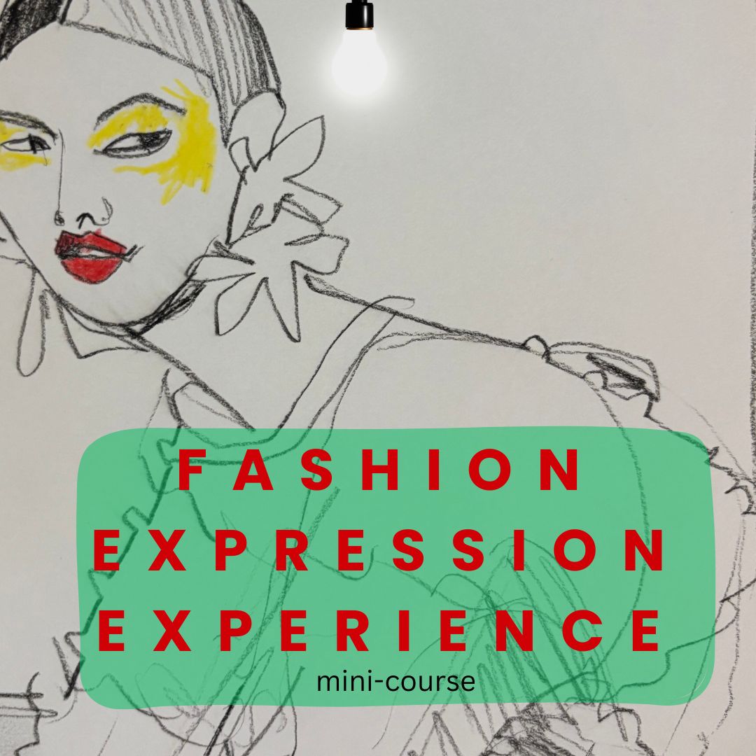
They currently live permanently inside of Fashion Expression Experience course, as well. Check it out!
I’m so excited to offer this, it’s going to be a blast!
Scroll down to enjoy the first of the series of FOUR videos and FOUR design journalling concepts. Each has a whole LIST of fashion design research and sketching projects and exercises in it for you,
all created by me for you, to deeply develop your eye for fashion, art, design, and…FASHION DESIGN- while discovering yourself in the process.
YOu’ll grow your visual, verbal, technical and emotional vocabulary in a deep, rich way.
Love
Laura
- notice if you own any asymmetrical fashion pieces at all? pay attention…. is it uncommon? Why, do you think?
- how do you feel when you wear the asymmetrical pieces?
- do you have a preference of symmetrical or asymmetrical clothing? why, do you think…. why, do you FEEL?
- look in your surroundings and fine-tune your eye to noticing the items in your environment... notice the symmetry and/or asymmetry in the things around you
- make a mood board in your fashion croquis book or in pinterest or a collage app… collect examples of asymmetry in fashion design that you like
- notice fashion poses that are symmetrical or asymmetrical
- notice your emotional reaction to symmetry or asymmetry- in fashion design and beyond fashion. In design in general also.
- play with the ideas of how you can take a symmetrical garment and MAKE IT ASYMMETRICAL somehow …. with the goal of improving or improvising on it aesthetically.
- try design sketching onto a croquis template with flats with ONLY FULLY asymmetrical pieces. HOW DOES IT LOOK/ FEEL/ DO YOU LIKE IT?
- notice how your eye moves around the figure while observing asymmetrical images, outfits, poses, art, etc…
- a really nice place to start playing with negative shapes is with necklines, armholes, hemlines and silhouettes: the places where the garment begins and ends, interacting with the body and with the background. Sketch some ideas and also notice how these different components of a dress, or a top, interact with each other and play off of each other!
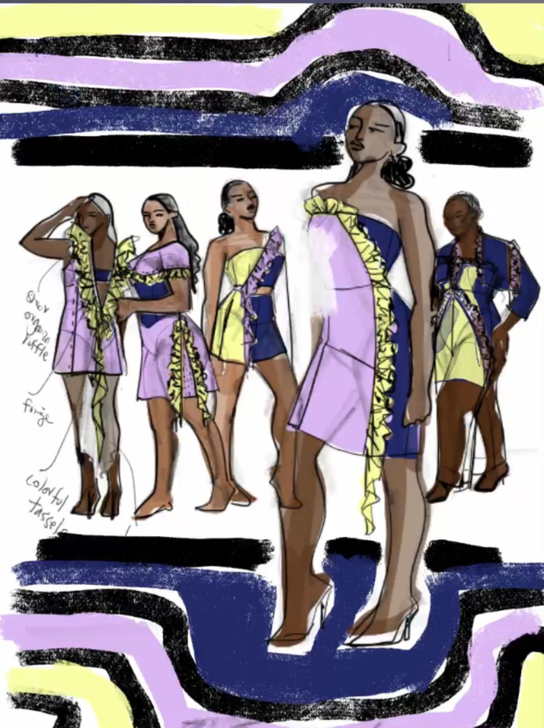
- cutouts: play with cutout shapes or color blocking (see the video on COLOR too!) panels of different colors or patterns in some basic pieces.
- check out this mini-course of negative shape model drawing exercises for fashion drawing/ fashion design/ fashion illustration, it’s will change the way you see and draw… I STILL use this exercise all the time.
- explore finding and creating/sketching negative shapes within asymmetrical forms….
- collect images on an inspiration board or in your croquis book of truly inspiring cutout/ negative shape effects. (We make inspiration boards in my FASHION DESIGN INFUSION digital course).
- do some sketches where you only draw the body, not the clothes!!! Only show the areas where the garment is NOT, where the body is revealed. OR vice-versa.
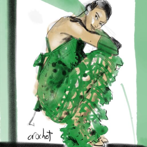
- play with the idea of negative shape created by layering and peek-a-boo effects (there are lots of inspiration images in the video / book)
- as you sketch several figures or garments on a page, make your “composition” intentional by noticing the spaces between figures or sketches and make them harmonious.
- also notice how your sketch interacts with the edges of your paper or page, creating negative shapes. COMPOSITION IS KEY. Remember that whether you are conscious or not, you are DOING IT. You are creating and using negative shapes whether you are aware that you are doing that or not!
- what associations do you have with certain colors?
- what memories and experiences do you associate with certain colors or combinations of colors?
- are the colors you love to see different than the colors you love to wear? why, do you think?
- when you design in your imagination, do you use colors that you don’t actually WEAR? or vice-versa? NOTE
- Do you associate certain colors with certain seasons or fabrics?
- do you associate specific types of colors with certain emotions?
- how do you like/ want to feel in colors? make a list of colors and their corresponding feelings, either with single colors or with combinations. If you have fabric swatches, use this as the basis and write your answers near the swatches.
- what feelings do you want to have when you dress or when you dress someone, how do you want them to feel, in regards to color?
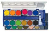
- use paint or fabric swatches to pull together colors that represent “your design world”– maybe you will create different color stories for different seasons or times of day or functionality. For work, for play, for sleep, for party, for every day, for holiday….etc… for men, for children, for women?
- sometimes it’s a wonderful exercise to create color stories (bring together combinations of colors) and (optional) NAME the story, as well as creatively name the individual colors..…. it helps us connect to the storytelling embedded in the colors
- are you drawn to certain cultures or geographies because of their “different” orientation towards color?
- prints usually bring together combos of colors. find some prints that appeal to you in terms of the color palette
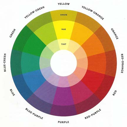
- monochromatic, primary, secondary, tertiary, tonal, neutral, contrast, complementary, analogous, warm, cool, hot, desaturated, unsaturated color themes. Learn these terms= study color theory (with me!)