Drawing Faces for Fashion (guide sheets and videos enclosed in this post)
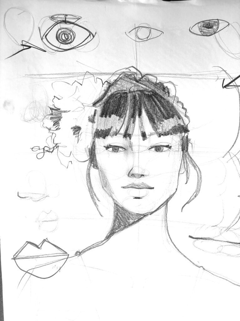
As a fashion design professor of 25+ years and having been a fashion student too, drawing faces is so important to me!
FACES are incredible storytellers.
Faces are communicators of the human in the sketch. Faces are capable of expressing SO MUCH that we as human observers are biologically wired to respond powerfully to. The way we draw faces communicates so much about our STYLE!
This is a double edged sword: if we love the faces we draw, we love the whole sketch. If we are tormented and struggling with faces, then it’s always nagging us. “What would it take to draw a face I can get excited about, or at least not bothered by?”
Proportion is a HUGE component of the issue for most of us.
NOW LET ME BE CLEAR: you are not required to draw realistic faces necessarily for fashion design!
Today I will share tips for drawing heads, hair, features and faces for fashion illustrations or costume drawings, but I’m sharing these tips and truths about proportions only so that you can play with them.
Try and see for yourself.

EXPERIENCE is the BEST TEACHER..
Because faces are SO EMOTIONALLY CHARGED, we have the most trouble drawing them of anything. I often find that my fashion students who have trouble drawing figures and faces have no problem at all drawing a bag or a chair.
We struggle with the proportions of the face when drawing because we tend to draw the proportions of our EMOTIONS. (example: the eyes are HUMONGOUS)
IT’S THE FEELINGS that get in the way.
And I’m the FIRST person to encourage you to fill your sketches with feelings! So the “cheat sheets” I’m sharing today to show the proportions and mapping of drawing a face are for you to use, and try, and then take what you like and leave the rest.
In life, it’s the TRUTH that sets us free.
And so,
What is true about faces?
Proportions and Placement Maps: Drawing Faces for Fashion
Often people think proportions are “rules” about how you should draw something. NO!
Proportions are TRUTHS, not lies. Many people teach fashion proportions as lies (“legs must be twice as long as the torso”, etc.) but we don’t draw that way here.

“PROPORTIONS” in drawing is about ratios and about relationships. In drawing faces or figures or anything else, it’s about HOW LONG OR WIDE something is IN COMPARISON to another length or width (- either its own or the length or width of something else). It helps us place things and to avoid having, for example, hands twice as big as the head or a face longer than the torso, the neck wider than the waist, etc.
Mapping out the features when drawing a face
- HERE ARE SOME TOP TIPS For drawing a face:
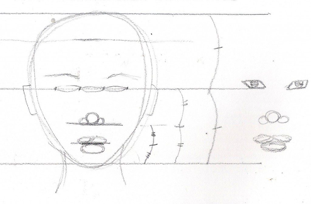
- The eyes are halfway down the head. NOT THE FACE, but the HEAD.
- The head is shapes generally like an egg, upside down.
- The head’s length is determined from the height of the crown, to the bottom of the chin. **most people are confused by this because the crown is not in the front of the head near the face– IT’S FURTHER BACK.
<<<<<USE MY PINTEREST BOARD OF FACES TO SKETCH FROM, HERE>>>>>
- The space between the eyes is about one eye’s width (believe it or not! Try it – EXPERIENCING PROPORTION is the only way to embody the knowledge.
- I place the center of the mouth and the bottom of the nose at 1/3s betweenthe eyes and bottom of chin.
- Focus on the center of the mouth more than the edges of the lips. Notice the shadow under the lower lip.
- Squint as you draw and look for the darkest lines or areas.
So grab a photo of a frontal face, a profile face… not looking up , and not looking down either, so you can practice the BASIC proportions.
Lots more on this in my online intensive, “ABOUT FACES” where we go into all of this and more in depth.
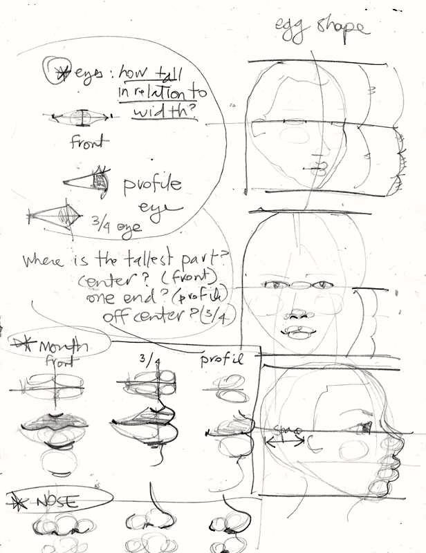
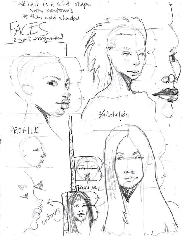
Proportions and Reference Lines- CHEAT SHEET
This sheet above shows reference lines (show them on your practice pages too!) the top and bottom of the head, as well as the mid-point for placing the features of the face on your drawing. I show the front view, the profile view, and the 3/4 rotation of a face here.
You’ll also notice above how I use plump spheres and ellipses to build and place the 3d forms before creating lines.
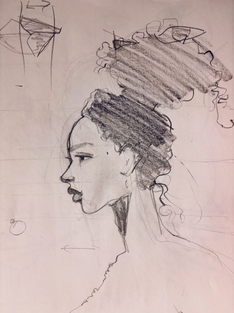
Also notice that hair isn’t so much something that gets ADDED to the head as it it is very much something that “invades” or overlaps the face and head. The exception is when the hair is very curly. The biggest most common mistake is students adding a lot of volume at the eye level to the hair when in the reference photo the hair is literally clinging to the head’s shape.
see below:
BONUS VIDEOS: SKETCHING HAIR FOR FASHION ILLUSTRATION from Afro /Curly to Wavy/Straight
WE love faces because the eyes are the windows to the soul.
Let’s keep the soul in fashion design. And the LOVE and the MAGIC and the JOY
LOVE YOU,
