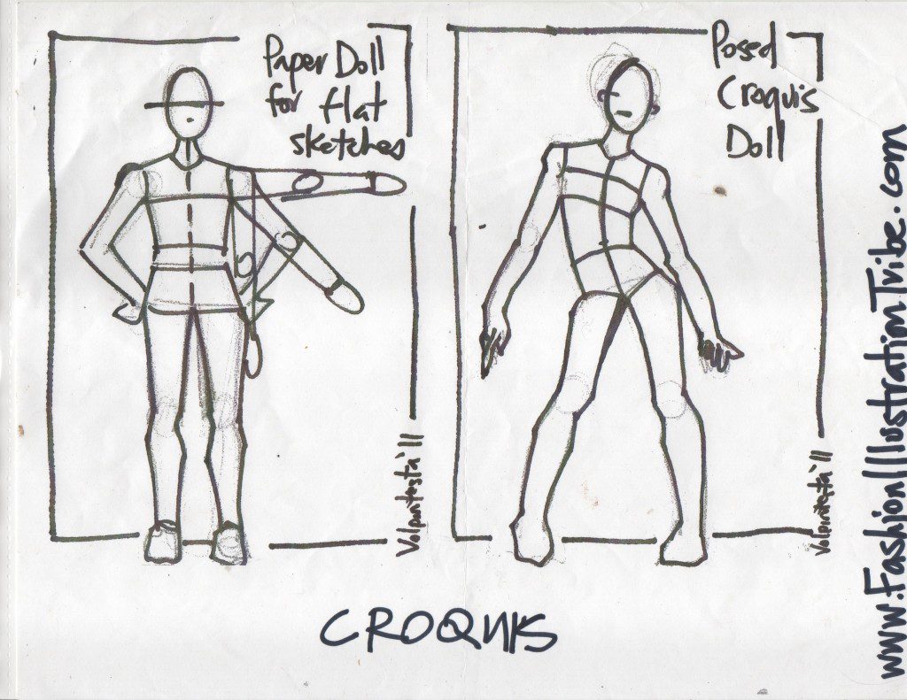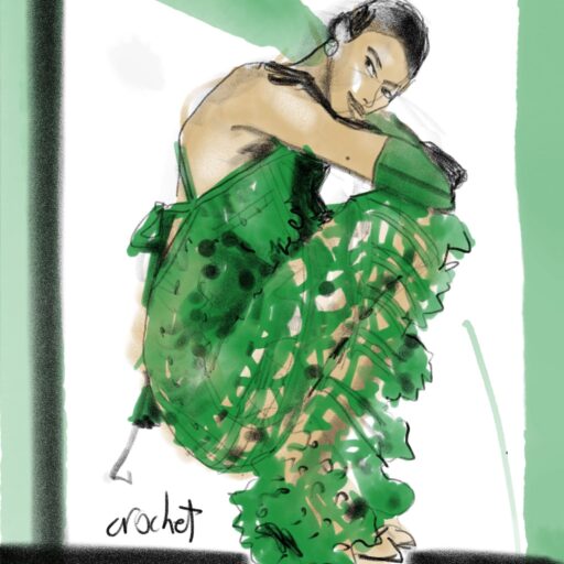
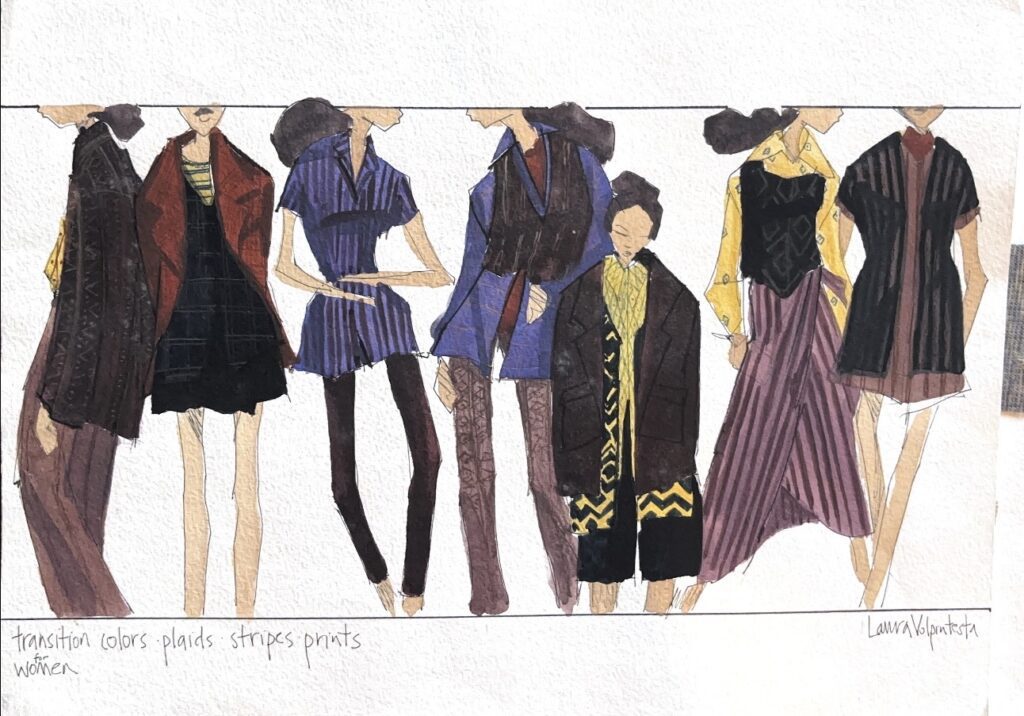

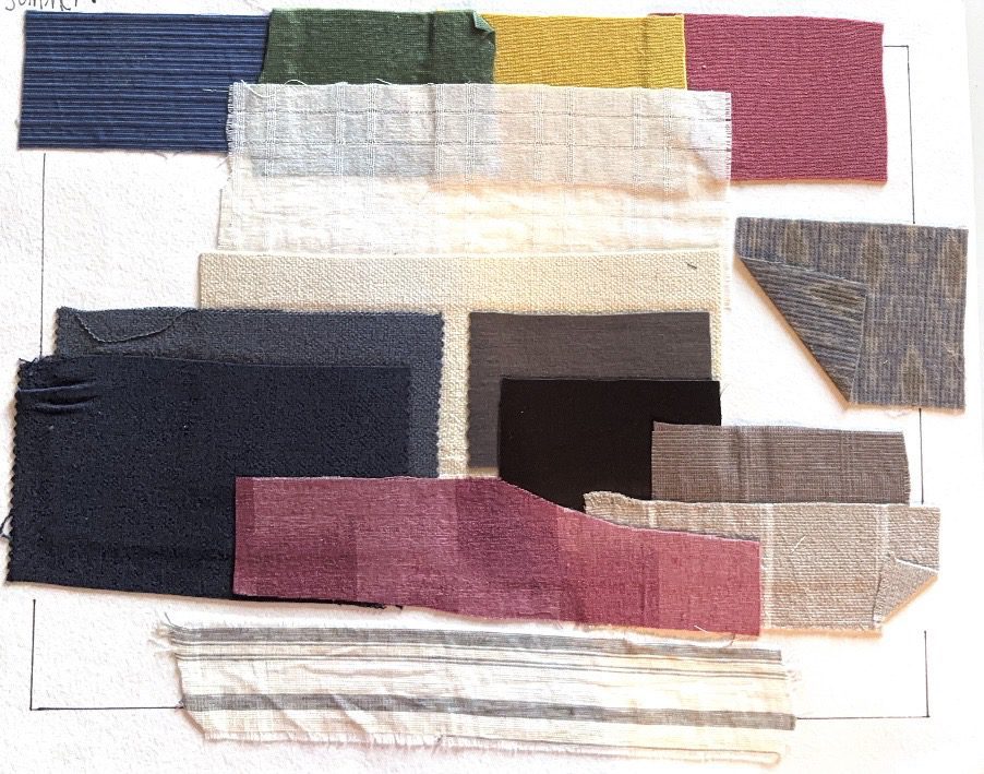
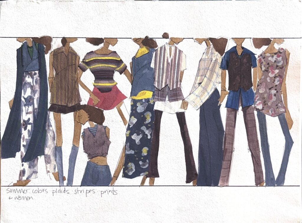
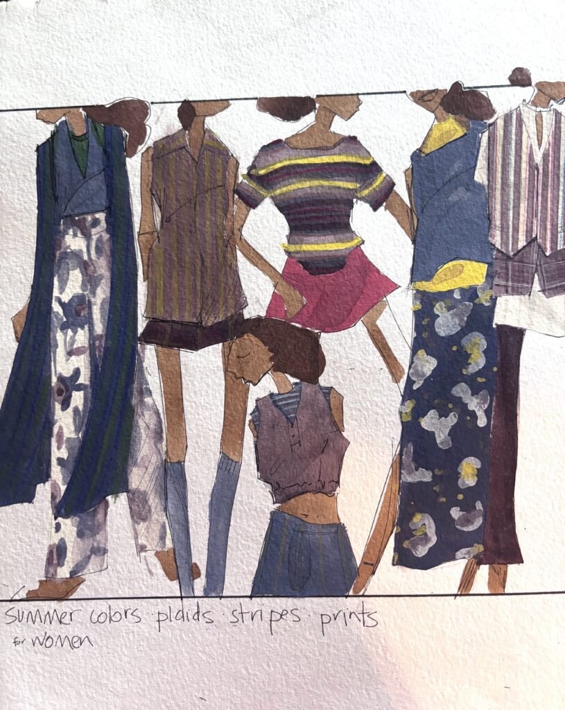
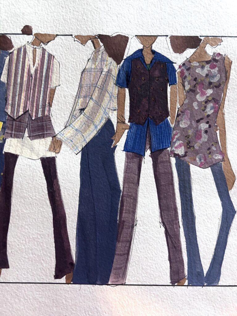
Learn the Soulful Arts of Fashion Design
I can't wait to see you grow in confidence as you develop your unique ideas into form!
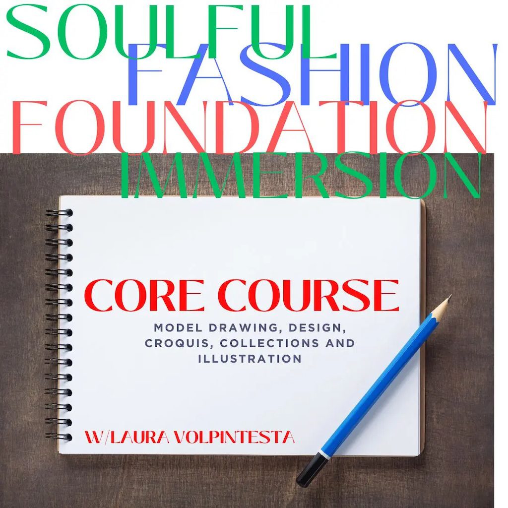
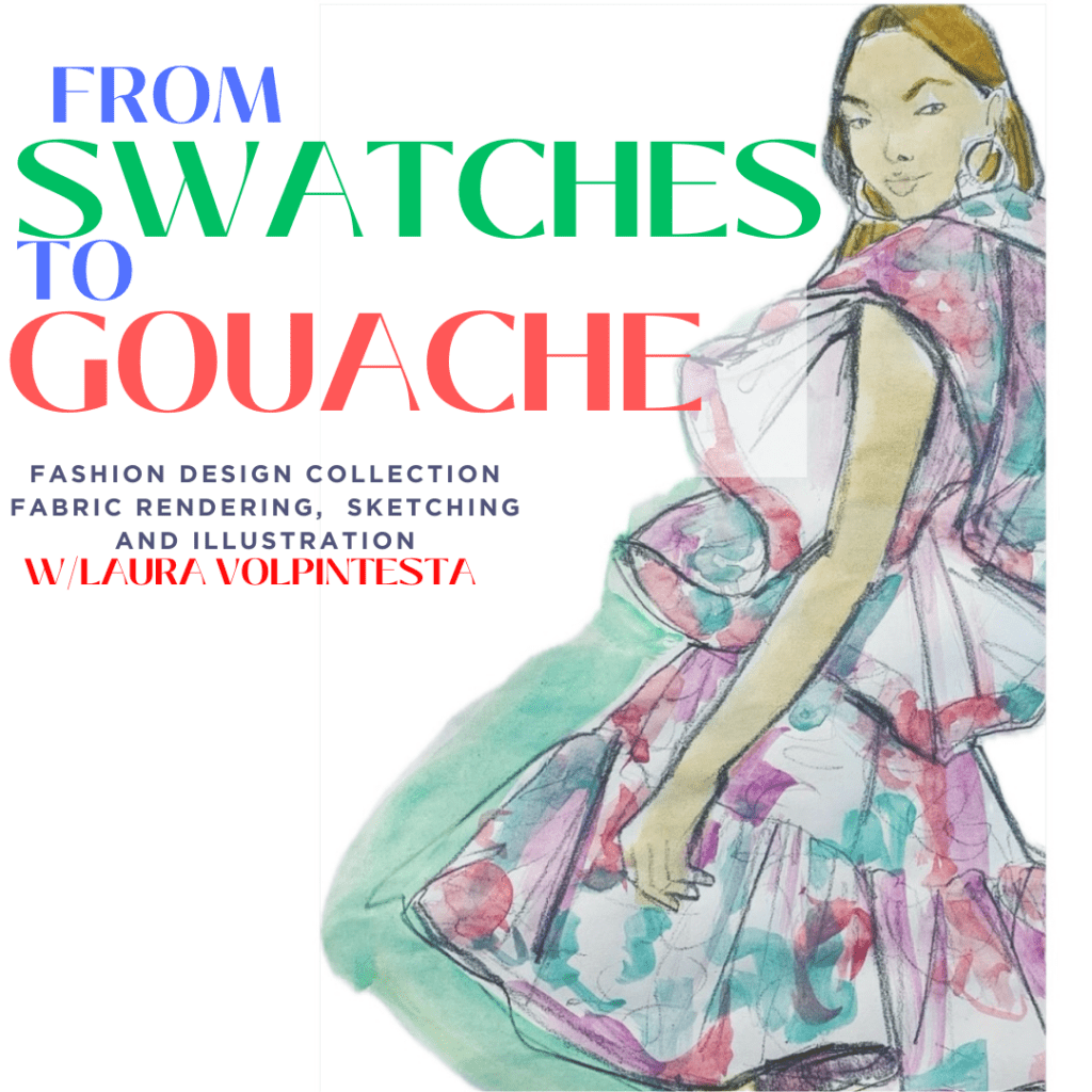
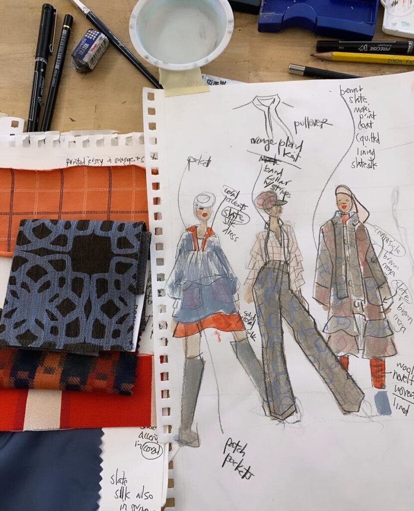
Access free LESSONS NOW on the info page for my SOULFUL FASHION FOUNDATION IMMERSION program, and learn more about how we can work together!
Laura
BEGIN TODAY FOR JUST $111
9 MODULES with immediate access: exercises, resources, projects, tutorials
Including