Gouache Technique for illustrating fashion- my process
4 GOUACHE COLORS YOU CAN’T LIVE WITHOUT!!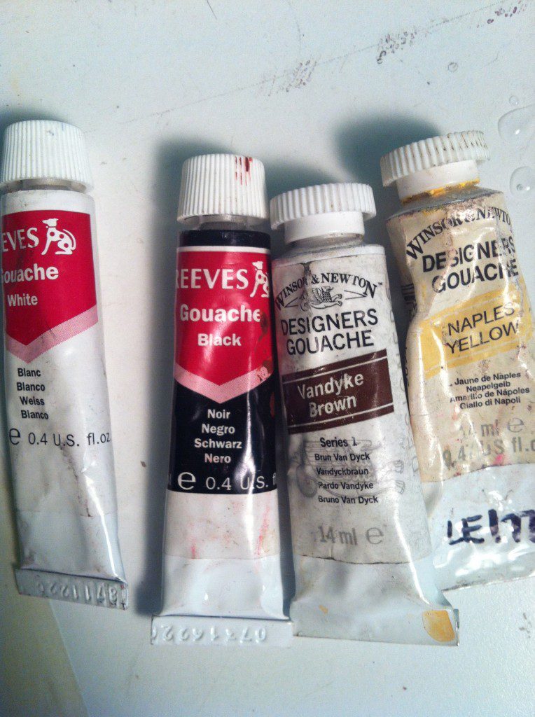
I’m here to introduce you to my gouache technique for fashion illustrations, which means to also introduce your to your
4 new best friends (besides ME) in fashion illustration!
While quiet in appearance, these four simple tubes or colors of “goo-AH-sh” will add dimension, life, and rich quality to your fashion illustration and can’t be substituted! Gouache is like a watercolor with a more masky, velvety opacity to it.
GOUACHE OPACITY- VELVETY TEXTURE
Today I’m going to take you through the work flow of one fashion illustration and show you how these four gouache tubes can be used and why I cherish them
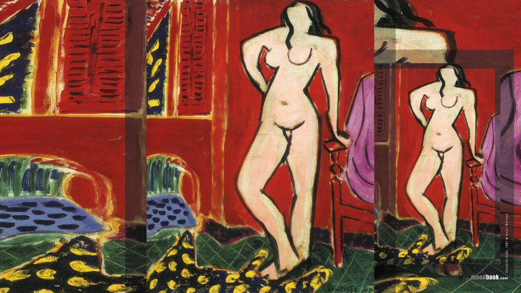
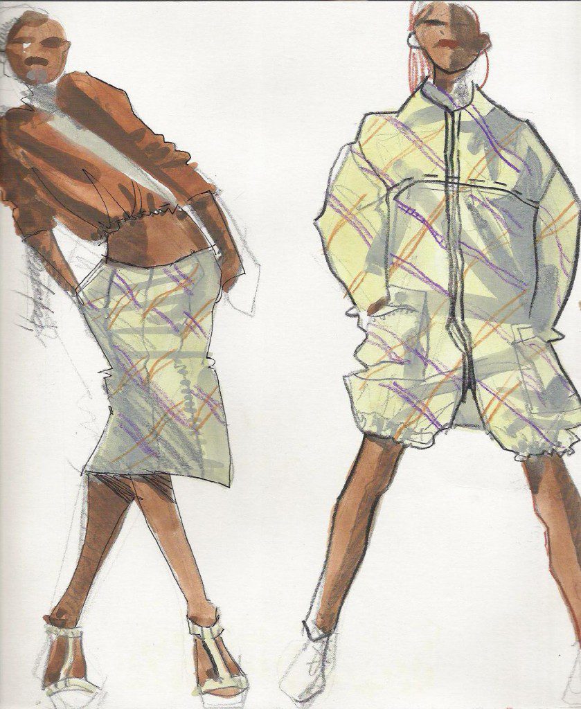
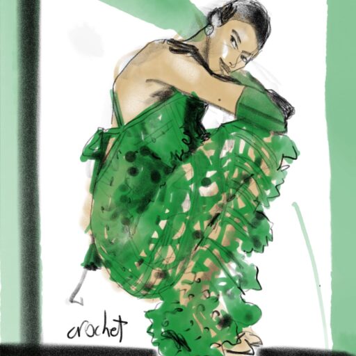
(I will be illustrating from a lookbook image from Alexandre Herchovitch, an incredible designer from Brazil who was introduced to me by ANOTHER A-M-A-Z-I-N-G Brazilian designer who was my student at Parsons for a few years, Fernanda Yamamoto.
She used to wear some of his pieces to class and I was always amazed by the designs. When she landed a job with Herchcovitch after graduation before launching her own line, she sent me a package full of these luscious lookbooks in 2007! So sweet.)
This Alexandre Herchcovitch SS07 collection is primarily printed, inspired by the Ndebele. 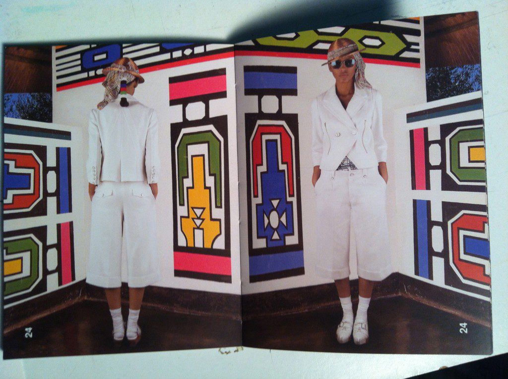
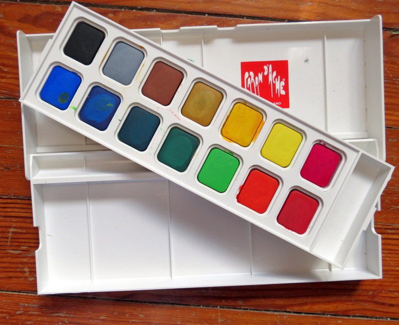
Gouache PAN BOXES, GOUACHE TUBES:
that I use for fashion illustration can be purchased in tubes or in dry palettes.
In the video above, I introduce my favorite selections and brands for fashion illustration.
An expensive tube gouache like Winsor&Newton, (Turner, Holbein, Daler Rowney, Shminke, Linel) have the most luxurious effect, yet I ADORE the portability and convenience of dry pan palettes of gouache. As tube gouache can often dry up in the tube, crack in the metal tube, or get a dried-on cap that won’t come off. Some of the dry gouache palette kits are referred to as “OPAQUE WATERCOLOR”).
Some dry palette gouache set brands: Grumbacher (rather dry) , Caran D’Ache (rich) , Inktense blocks set of 12 (intense pigments, portable- need to buy a white tube on the side) and Pelikan (affordable, great collection of colors) are my top recommendations for dry gouache palettes.
Gouache is that– opaque watercolor that has a more flat and velvety surface. I love it because it looks like fabric, and the painted shape takes on a defined silhouette that has so much more impact than a simple line drawing.
GOUACHE TECHNIQUE workflow in this post
I’m be using gouache techniques for fashion illustration in most of my online courses, (all linked in the header of my website under the COURSES tab or on my homepage)
WORKING WITH WHITE
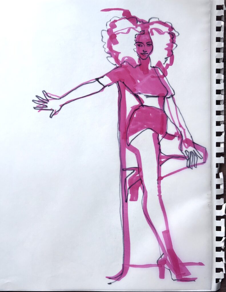
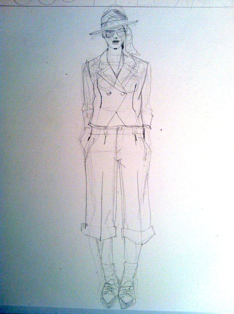
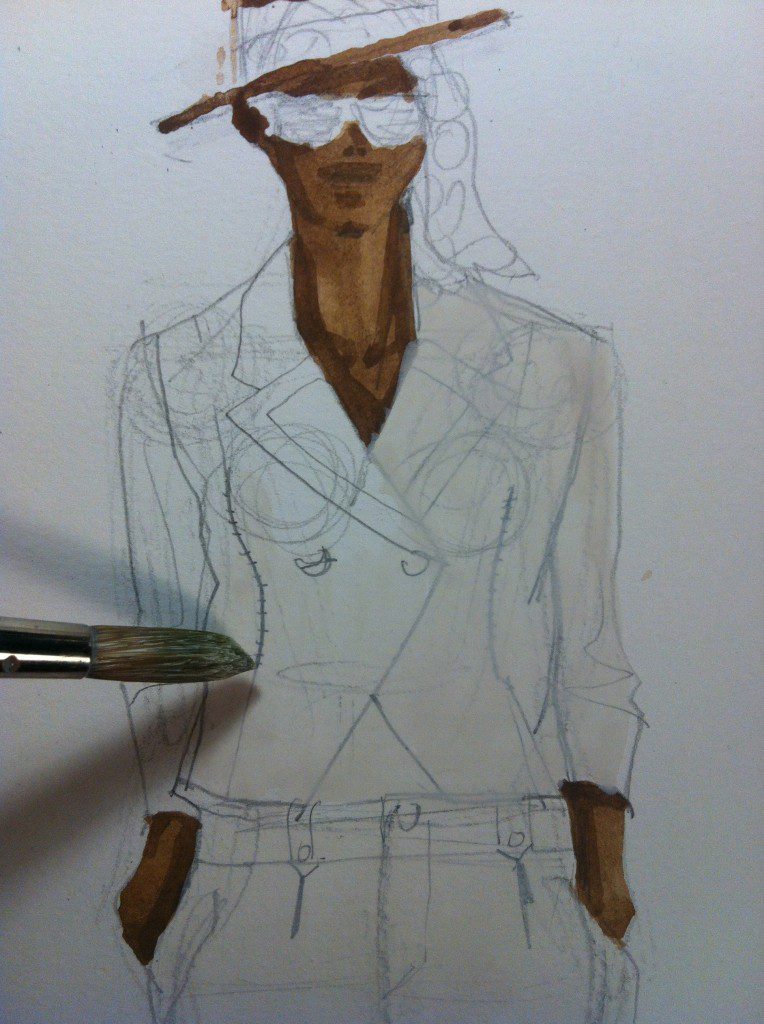
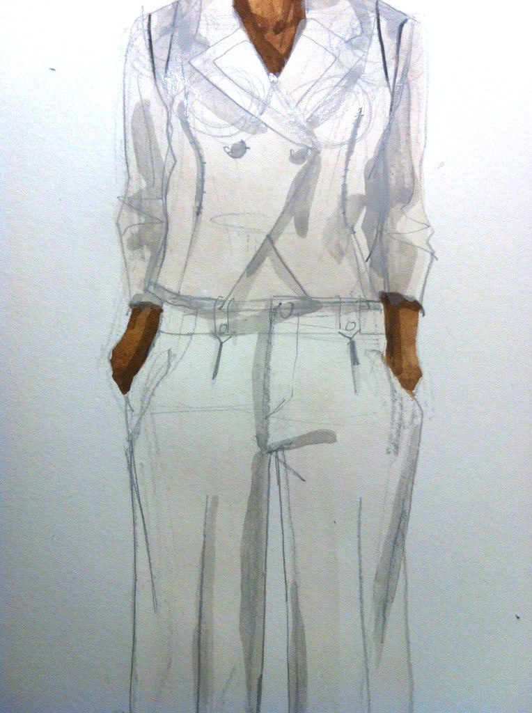
Today I’m sketching a white suit.
In developing your fashion illustration style and confidence, I highly recommend doing some studies in white before moving into color, because it’s such a clarifying way to study and practice shading and shadows.
BUT FIRST:
BRUSHES FOR GOUACHE FASHION ILLUSTRATION :
Fashion Illustration
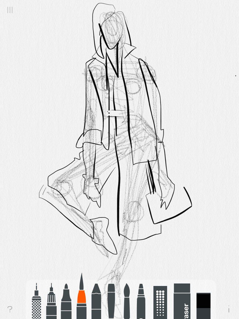
Step One: SKETCH
I sketch my figure: lightly in pencil so I can decide where paint will go.
For finished illustrations, I use BRISTOL VELLUM. For quick fashion sketches in my croquis book, I use SKETCH (thinner) or DRAWING (thicker) paper. The pre-sketch essential to my gouache technique so I’ll know where to apply paint! Otherwise I’m freestyle improvising paint onto paper.
Next I break out the first two AMAZING TUBES of paint that EVERY FASHION DESIGNER /ILLUSTRATOR must have.t
Fashion Illustration
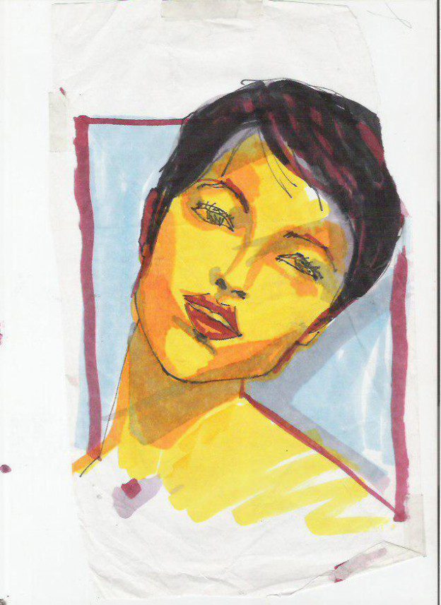
Step Two: SKINTONE
Naples Yellow and VanDyke Brown by Winsor&Newton
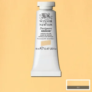
There you have my big secret! Whether you use dry pans or tubes, I don’t care, you still have to have these two colors on hand, for easy and reliable skintone gouache technique.
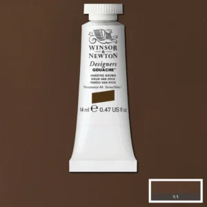
Naples yellow is a bland, creamy yellow on its own, but add ANY amount of Vandyke Brown to it, and you get a range of skin tones from fair to the deepest skin in a natural, balanced range of browns that can feel warm and cool, complimenting any fashion palette that you have designed with.
It’s so important that your skintone isn’t too green or orange, it tends to distract from the clothing if your skintone is “off”. This is why I cherish this recipe I’ve shared with you!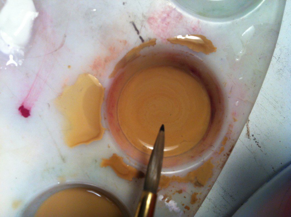
I like to mix races everywhere I go in search of world peace, so this really works for me. And who wants to sit around mixing complex recipes of skintone like I learned in school? This recipe is SUPER-SIMPLE and gorgeous.
See the range of tones I swatched up at the top of the page: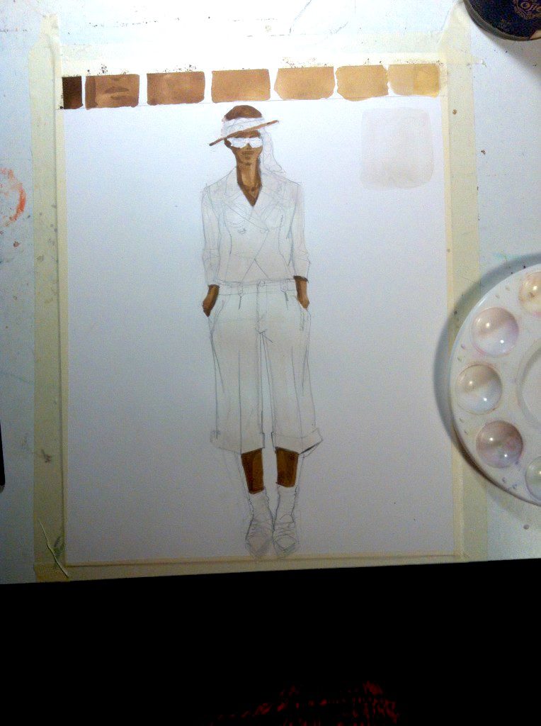
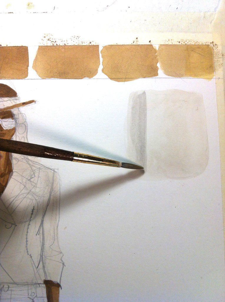
Next dream color? WORKING WITH THE MAGIC OF WHITE:
You can’t live without white!
Fortunately, your paper offers up lots of white by its very nature.
Gouache can even be wiped or blotted away to make highlights on your garments by revealing the paper under the paint.
But the wonder of white is that it can add a warm, creaminess to any color that is coming across too “watercolory” , thin, or sheer on the page. It’s an excelletn addition to communicate that a color is light, but thick, rather than sheer, for example.
WHITE WARNING: DO A TEST SWATCH
BUT PLEASE TAKE NOTE: white colors can look lighter when they are wet, then dry darker— always , always, always do a test swatch on a scrap of paper, and don’t approve the color until it dries COMPLETELY. If I want paint to dry more quickly, I leave it under a lightbulb to bake dry.
(Then I go get a glass of water, tea, sketch some flats, or see what other tasks are waiting for me while it dries).
My comprehensive fashion design and fashion illustration program gives lots of specifics for how to match colors exactly to your fabric selections.
The ensemble I’m illustrating today is actually white…. but notice in the photo the opacity that the paint gives.
(I recommend that ALWAYS paint white garments white– it looks much better than just leaving plain paper where things are white. It makes a big difference!!!)
The FOURTH Final Fabulous and essential color:
BLACK!!
I can’t begin to talk about the power of black for shading, adding depth, separating layers, giving 3d form to your fashion illustrations.
You can also use it to add surface textures like furry, curly,, corduroy or quilting., and mixing difficult-to-match colors.
BECAUSE BLACK ISN’T “JUST BLACK”.
Black is a color we add to other colors to creqte TONES- less saturated, lower valued tones that recede in space and make brighter areas POP forward visually in contrast.
Look below,how I can add a pinch of black to the skin tone to create a mouth purely by using shadow tone. I also add some black to my white suit color and test my shadow tone on white in a swatch before applying it: (let it dry).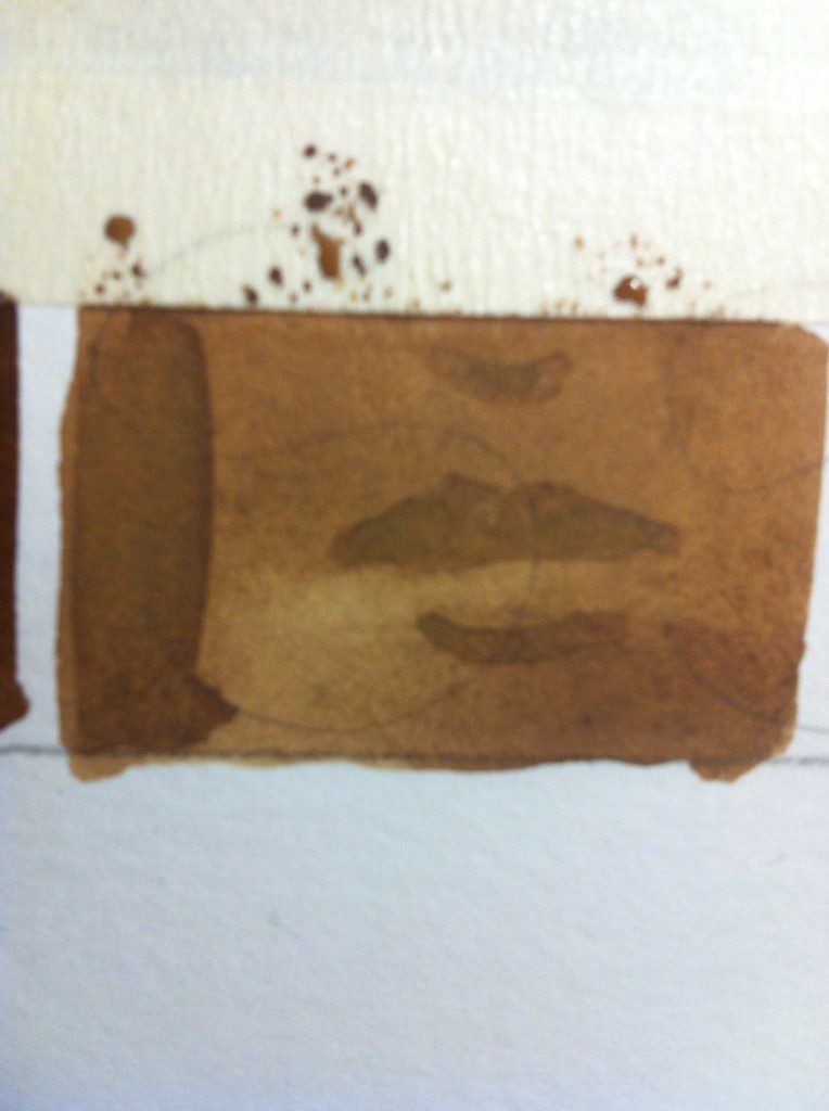
Finally,
I didn’t mention my
order of operations for a finished fashion illustration:
- Lay down skin first, after it dries add shadow tone.
- Lay down each garment color AFTER SKIN TONE or adjacent garment color IS DRIED (this is why its nice to work on a few illustrations at once- by the time you finish laying skin or garment color down on each look, the first one is DRY and ready for shading or another color!!).
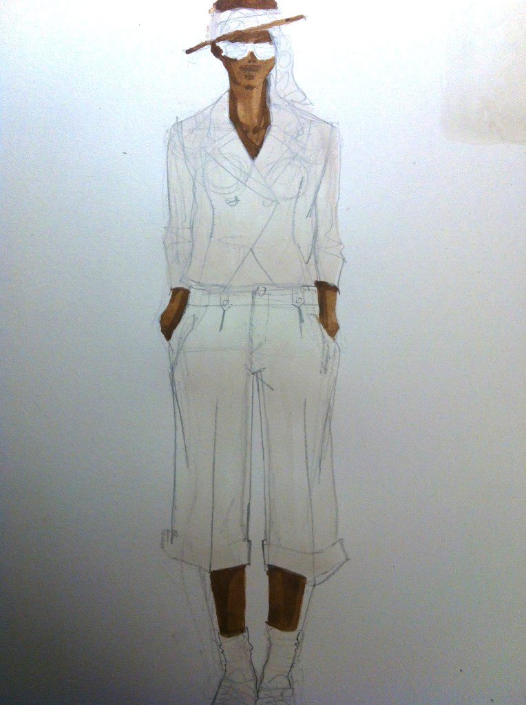
3. After each garment color dries as a flat tone, add a bit of black to it (same process as for skin) to create a shadow tone:
“HOLD IT!!!!!!”
We’re in the final stretch- gouache fashion illustrations love THE HOLDING LINE
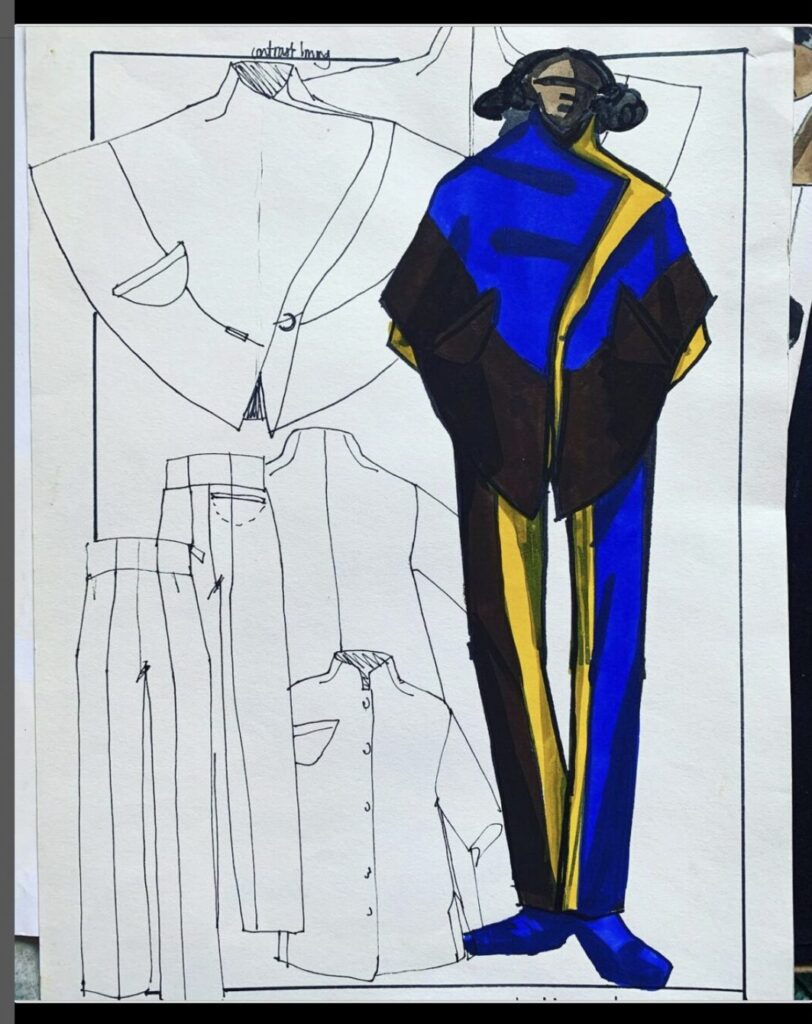
So I’m grabbing my Ebony pencil and putting in all of the construction design details. This will leave them crisp and articulated over the dried painting.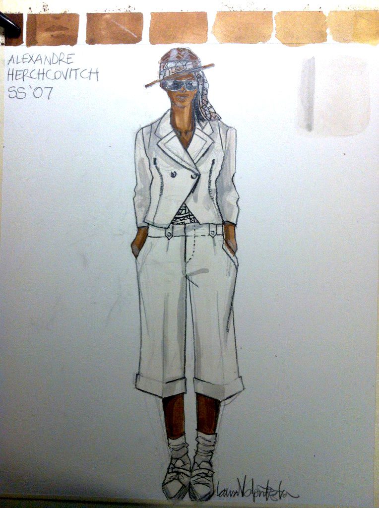
(Notice I’ve taped down my Bristol vellum paper all around- this is something I do so it won’t wrinkle up when wet).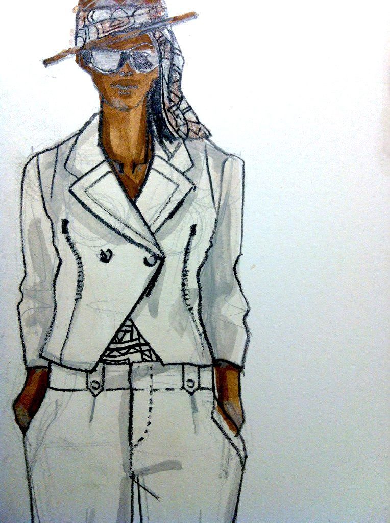
Yes, they are more visible than in the photo, because the purpose of my fashion design illustration is to show and describe the DESIGN as well as mood, to show how the piece is made and ingeniously put together.
Just like you.
So whatever other colors you have,, and whether in tubes or pans, just purchase these four tubes to make your gouache technique better for fashion illustration- which ALWAYS wants skin color!
And please, share what you think in the comments below!
(snapshots of sketches are okay, but you can see here how hard it can be to get good lighting)
Love, Laura
Don’t forget, we’ll be using gouache techniques for illustrating in my online intensive program.. We can go through it all together, step by step, until you have your skills down, then start releasing your unique voice and style. COME AND REALLY DO IT!!