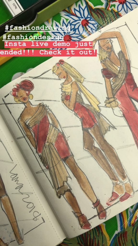
So you spent an hour or two at your fashion sketchbook. Or stayed up all night in a frenzy of inspiration..
Chances are, you look at it later and you have mixed feelings. There’s a lot that you love, and there’s a lot that feels like it’s “falling flat”.
DON’T GIVE UP ON YOUR WORK!
You’ve finished the “hard part” (actually, the total thrill of channeling your ideas and watching them come to life)
Now, “fun part” #2 is rearranging and touching up, laying out and cropping your work!
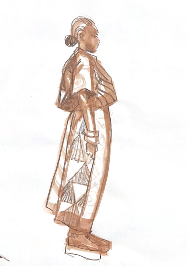
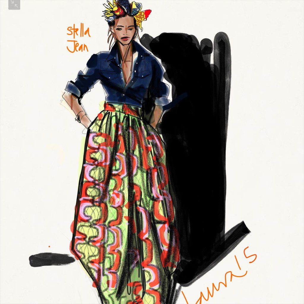
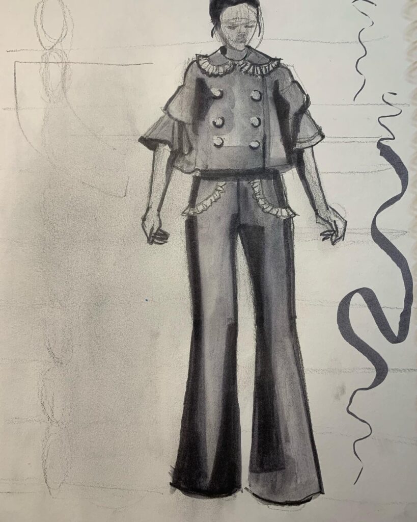
Come on, I’ll show you how I revisit a sketchbook page and take it to the next level for more dynamic impact.
In today’s video, I’ll share some of my favorite tips for fashion sketchbooks, croquis books, and fashion portfolios.
The point to catch is that there is SO MUCH YOU CAN DO AFTER you’ve finished design sketching to enhance it and present it so that you like it EVEN MORE THAN YOU DID IN THE FIRST PLACE!
And this isn’t just in case you are trying to impress someone else with your presentation…. Above all, you want to impress YOU!!!
We want to feel good about what we’ve done. So Let’s go!
Highlights:
- gouache vs. watercolor, pros and cons.
- tips for shading your fashion illustrations and design sketches so they POP
- layout, design elements on the page that enhance your story, organize your fashion sketches. Of COURSE you want to add interest, dynamics, layers of space, etc.
- sketchbook recommendations- why do I love LANDSCAPE layout for my fashion sketchbooks and fashion portfolios???
Don’t miss these other recent sketchbook videos!
love,
Laura

