Fashion Illustrators: Using Tinted Papers
It’s so exciting ot use a tinted paper, toned background, medium or dark ground for Fashion illustration.
And I invite you to come and explore with me here on the blog and in my courses!
From traditional to experimental, from “analog” (paper and pencils, watercolors) to digital, to the range of voices out there, fashion illustration will always be a powerful voice in the world becasue i fashion illustration is a story of people.
It says so much!
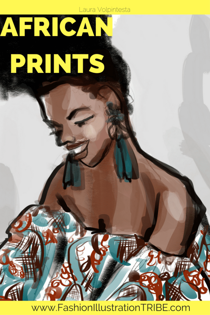
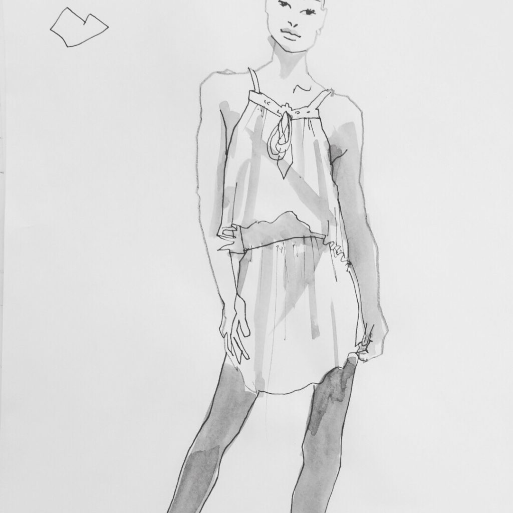
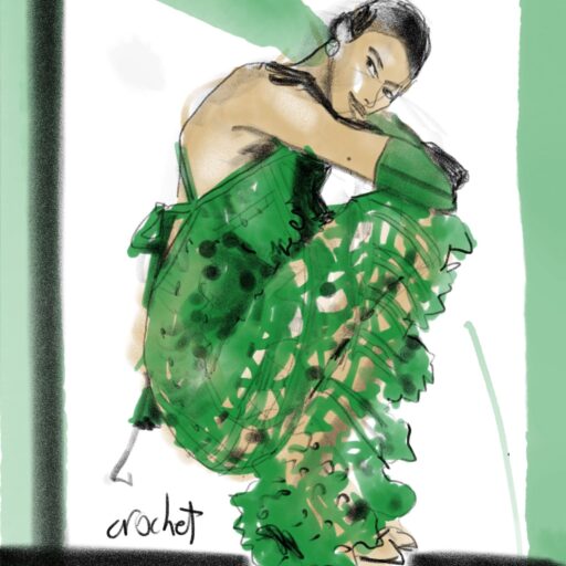
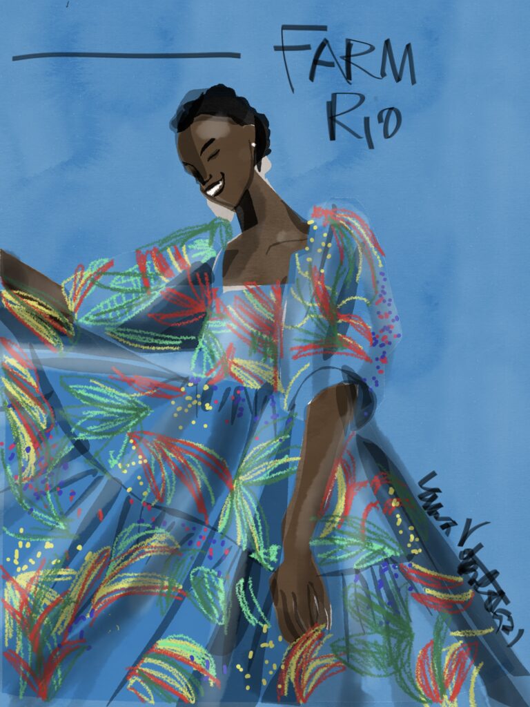
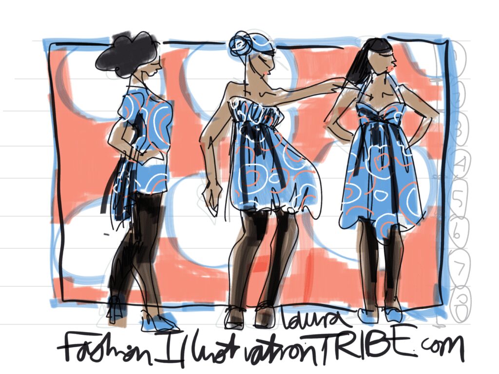
Here is my recent digital fashion illustration of a Stella McCartney ensemble.
In my definition, fashion illustration is a wide scope of expressions
Whenever we take fashion, humans and the human body, and adornment– and express it through art, that’s fashion illustration to me! Even if its making a doll, I consider that doll a fashion illustration in 3D.
TINTED PAPER AS “MEDICINE”
Today I’d like to focus on the use of TINTED PAPERS in fashion art, fashion illustration with attention to its “medicinal” qualities.
What I mean by that, is that:
Tinted paper is an AWESOME way to get a fresh approach to your art.
I always say: we are so conditioned from our childhood school days, stuck with white paper and a sharp black pencil, learning symbols (letters).
TONED PAPER helps us move into a different paradigm that can liberate us from those restrictive associations and move us into a fresh, clear creative space.
…among other benefits that colored paper gives us.
EXAMPLES
A FRESH EXPERIENCE OF PAPER
NEW ASSOCIATIONS IN THE BRAIN:
We can all get stuck in that “‘white paper, black line” mindset that I’m convinced comes from learning our ABCs as kids.
Suddenly using white pastel on black paper, or a wash of white gouache on grey paper, you start to draw with “light” instead of dark.
I often say to my students that its like dancing in the dark.
Many people are shy to dance in bright lghts on an empty dance floor.
They feel exposed.
The same can feel true for a clean sheet of bright-white paper.
Warm, medium toned or dark paper invites us into to a more private feeling space.
DARK, MEDIUM, OR PALE TONED PAPER: DIFFERENT FEELINGS
Another great way to experiment with your fashion illustration skills is to give yourself a midtone paper like grey or a similar tone, then use black AND white on it.
PAPER OPTIONS
Try using white wet or dry media on a paper that isn’t white.
Newsprint is a textured, gritty, inexpensive paper with a gentle tone, whereas the digital black rice paper is another feeling entirely.
Heavyweight racing vellum has a greyness to it that can also be delicate to feel into.
Brown paper bag is a readily-available that you will feel more immediately as a NEW experience.
The black lines and tones will recede visually, while the light or white ones will appear to “float” or move forward… that’s the big TIP!!!
I would save the black for the end, to avoid relying on it too heavily at first.
Because drawing with black has become a habit for most of us.
Start with white!
HUES versus NEUTRALS:
Neutrals, on the other hand, won’t have a lot of impact on your color palette.
Here, the blue dress is swallowed up into the blue background:
Here, orange background swallowing up the orange dress similarly:
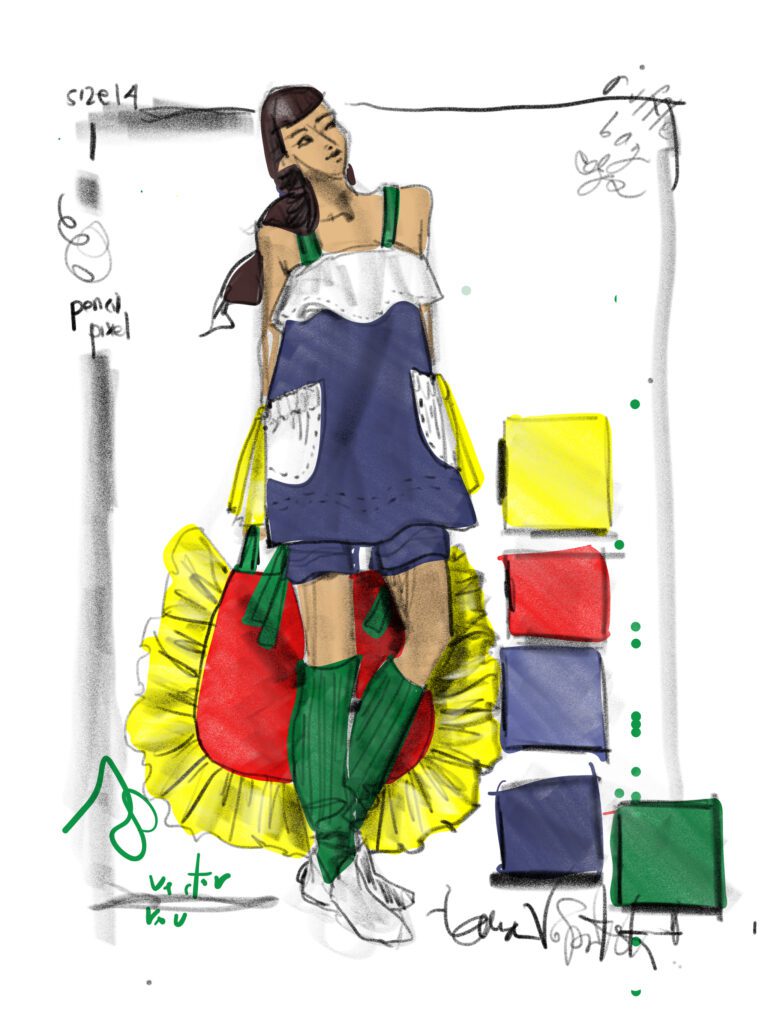
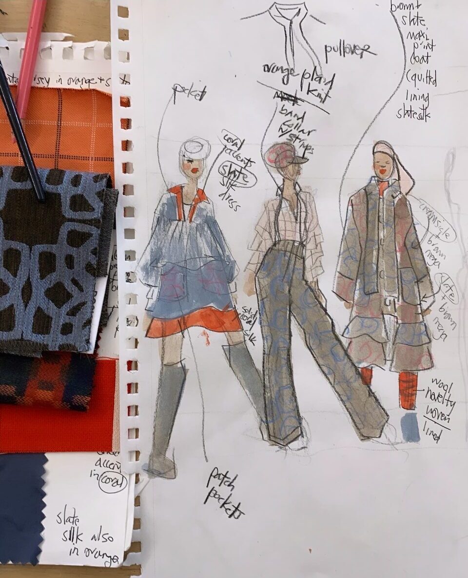
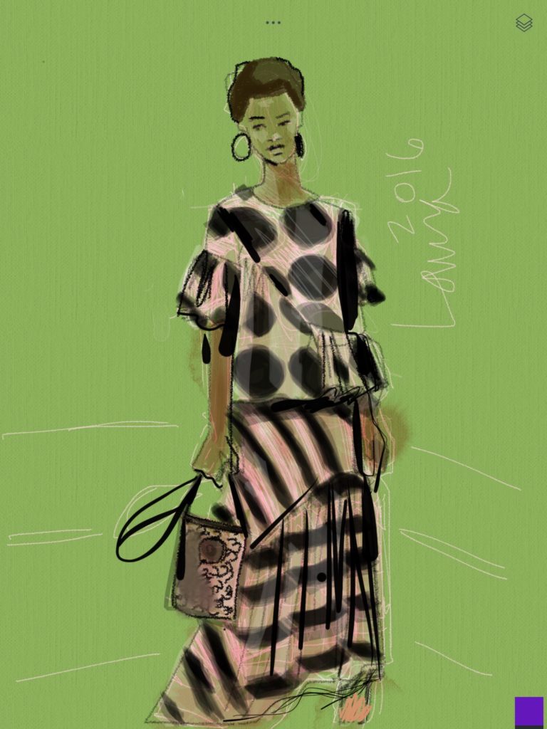
Meanwhile, in this sketchbook design page, I used an orange based background to make the blues stand out in the printed patterned fabrics. Though my paper was still white, in fact.
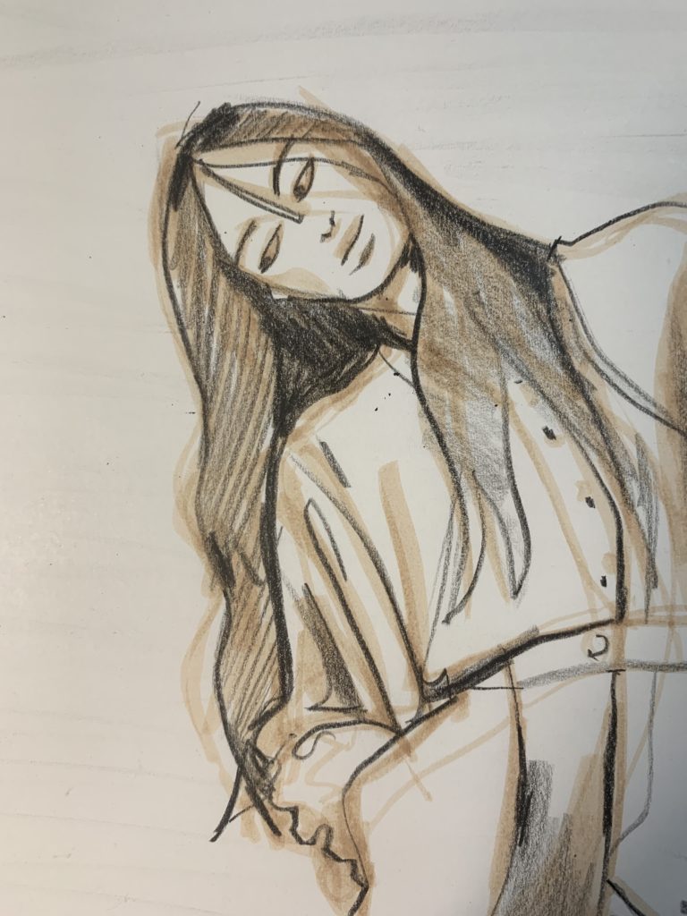
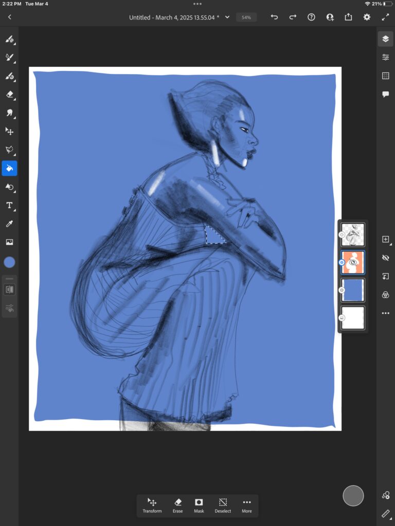
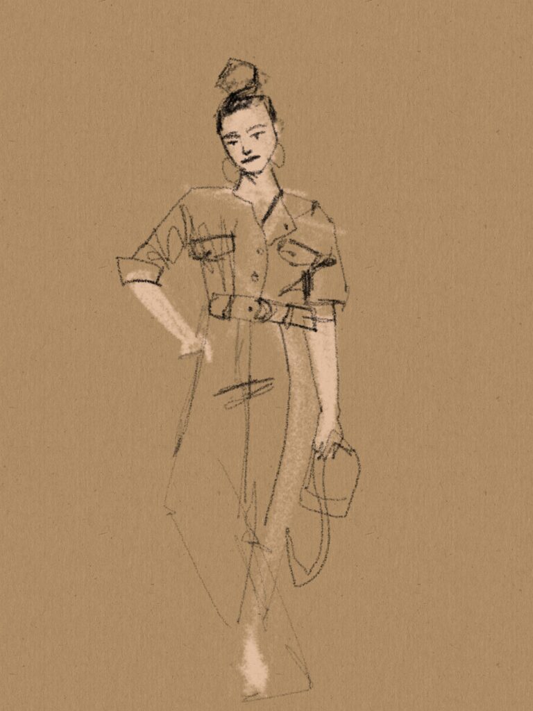
SKETCHING IN A LIGHT TONED PENCIL ON MEDIUM TONE PAPER
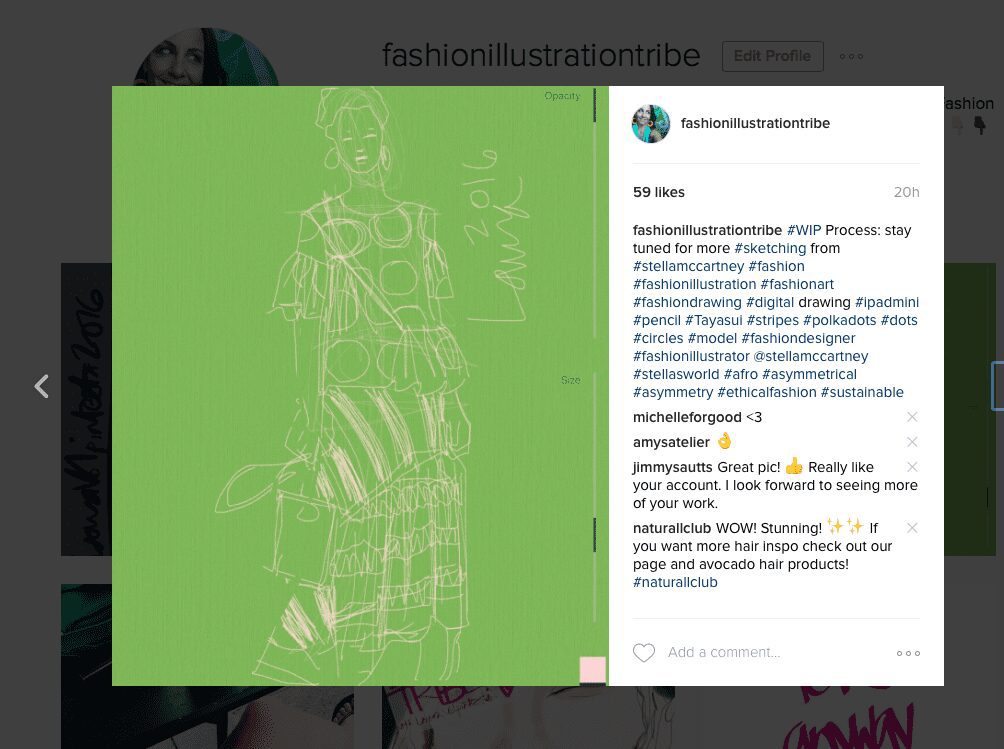
Below you’ll see how I used tinted and textured “PAPER” ( I was actually sketching on my iPad mini) and peach colored pencil tool in Tayasui Sketches App to sketch out a fashion illustration.
As usual, I sketched lightly before filling in with digital “watercolor”, “marker” and “brush pen” tools.
Here’s a behind -the-scenes sneak peek at how the digital fashion sketch began. Learn more in my courses too!
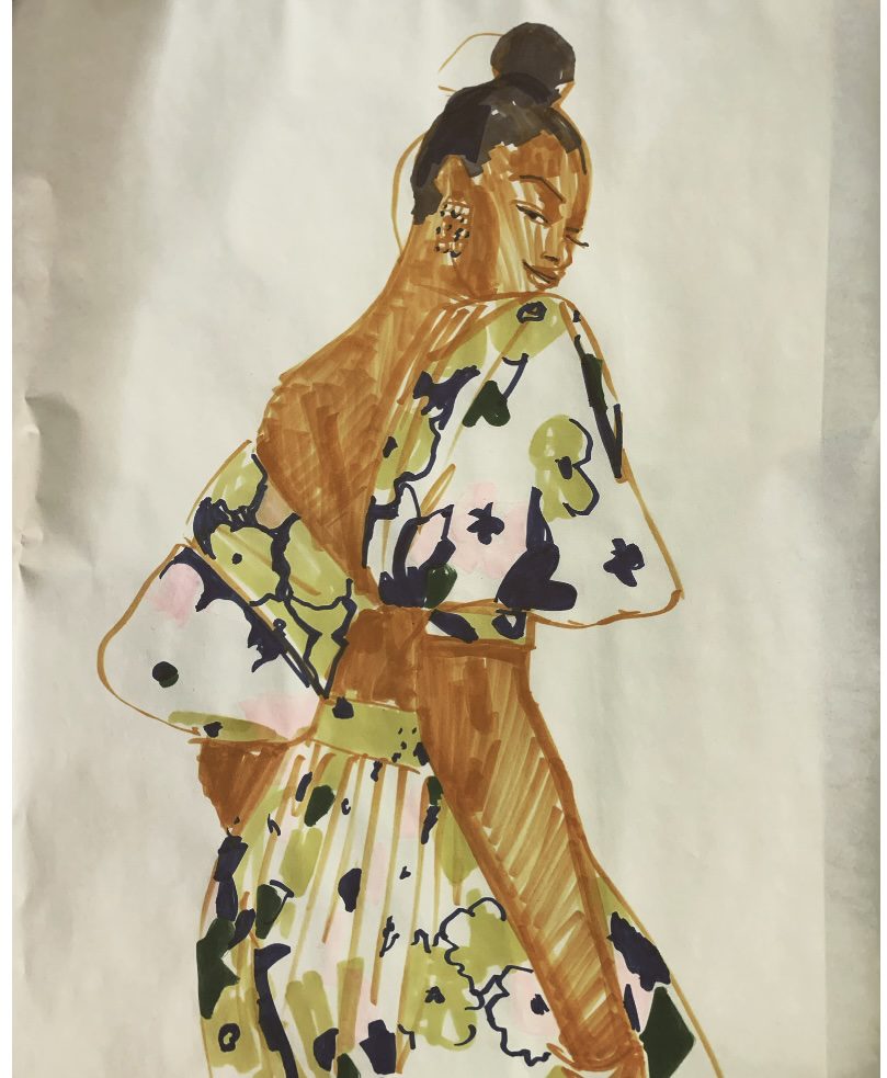
Fashion Illustrators have used tinted papers forever
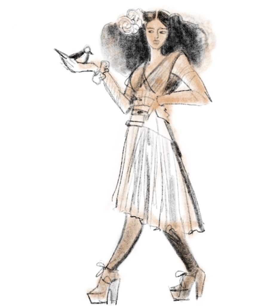
VG Waymer is one of my favorite fashion illustrators. Look how she uses tinted papers.
She’s contemporary. See how the light tones float and “pop” visually?
Also notice how some are opaque, like the background, and some are sheer.
Her background is very smooth, while the one in my sketch is textured and rough.
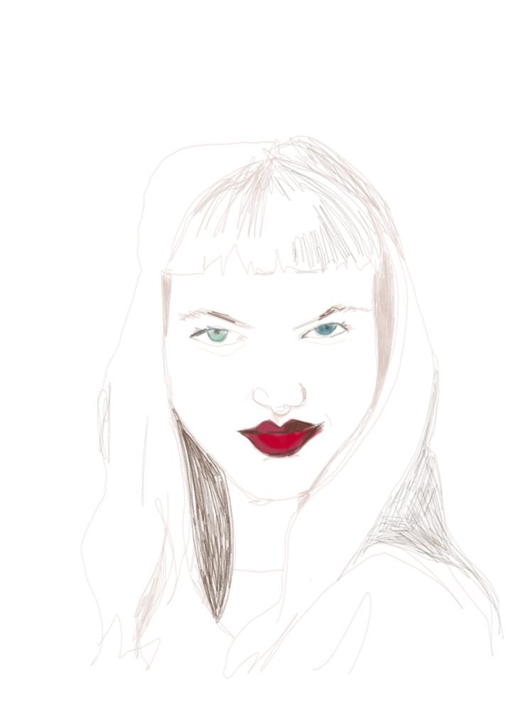
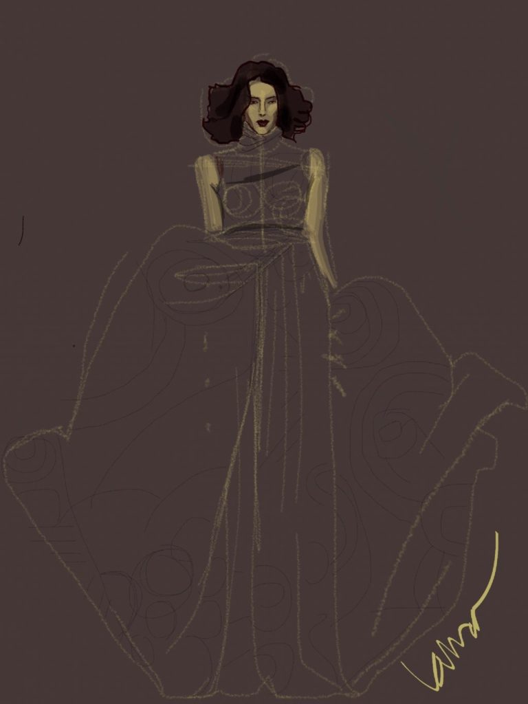
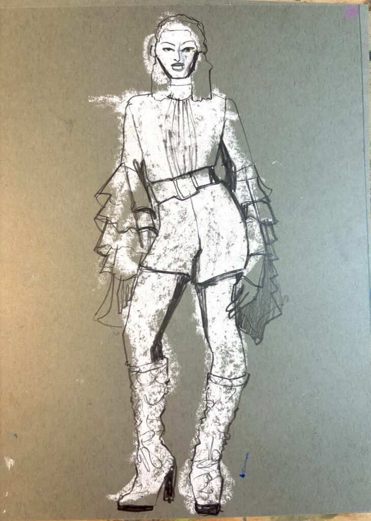
In this fashion sketch I used a grey paper and then used lines, shapes and crayon/ paint tools for highlights and dark tones.
The paper became the skintone “foreground” while the” background ” was added after, in blue!
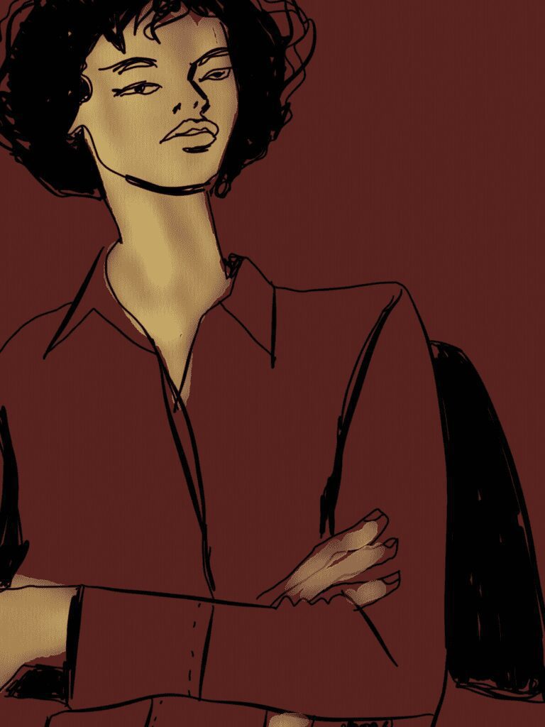
Cool change in perception, right?
For an analog, gouache example, let’s look at the late, legendary, great fashion illustrator Kenneth Paul Block did a ton of work on grey paper.
See below how he used white and black and got flat , sharp yet loose silhouette shapes.

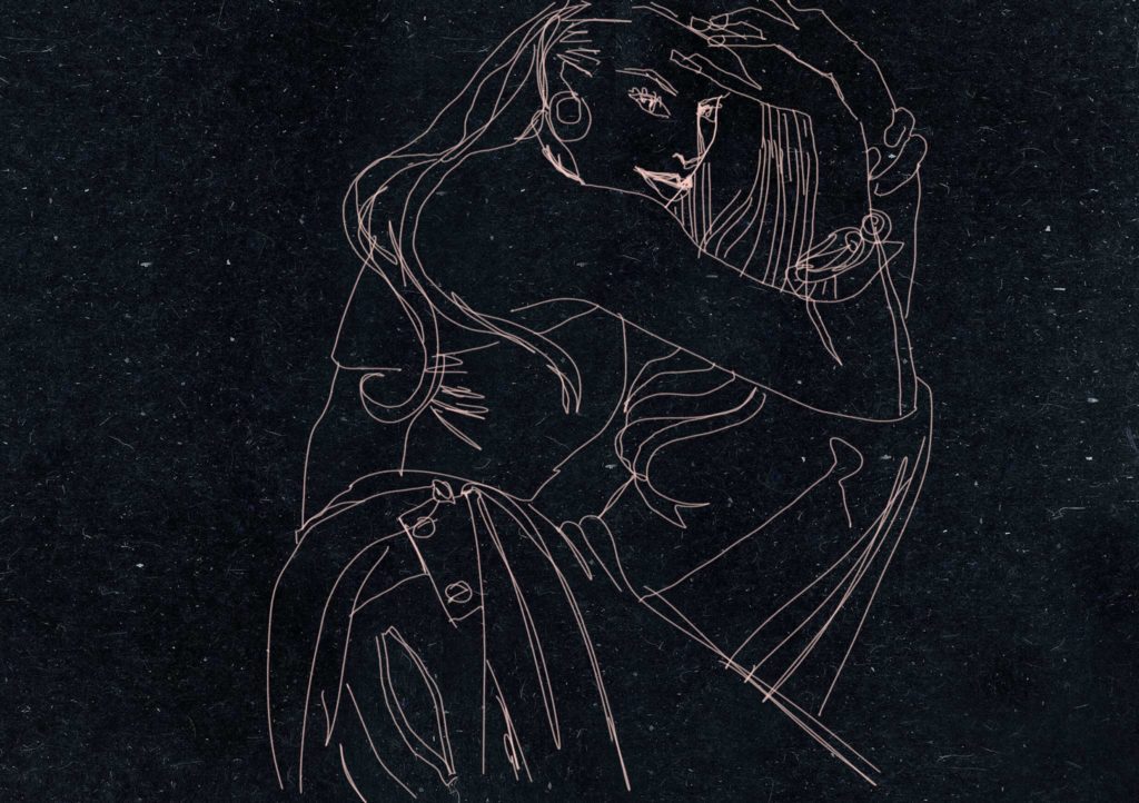
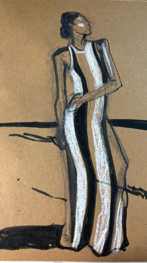
I sketched this look by Layana Aguilar on toned paper:, by starting with a gesture drawing in white oil pastel.
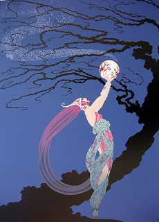
Finally, let’s go all the way back to Erté. His was the first book of fashion illustrations I ever owned. I love real body proportioned beauties and the flow and movement so immediately obvious in pieces like this one. And of COURSE, the pure raw imaginationa and creativity in his ideas.
Again, there’s a mid- tone background, sprinklings of light and white, and then black for depth. And this is PRE-DIGITAL, even though it’s so incredibly smooth-looking!
.
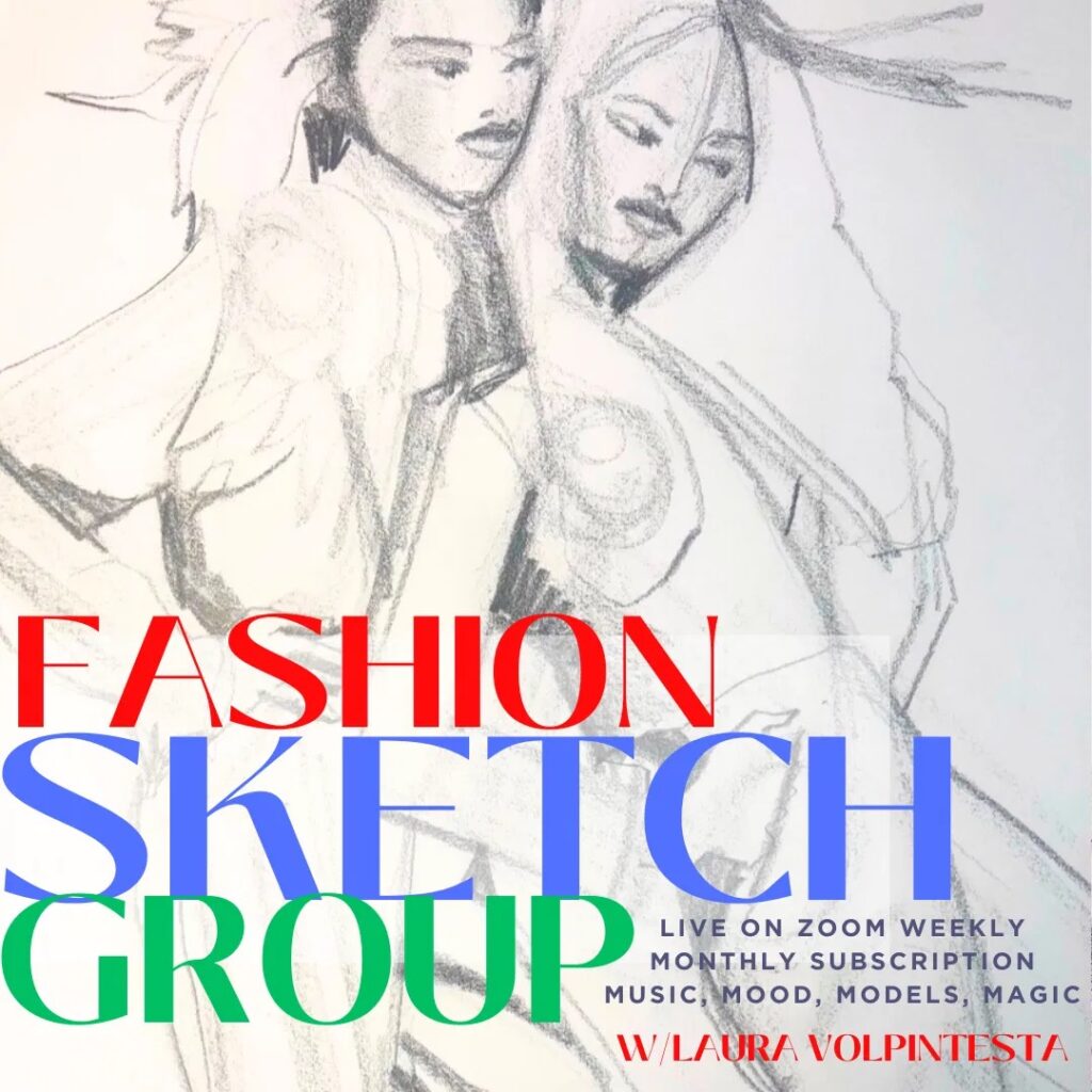
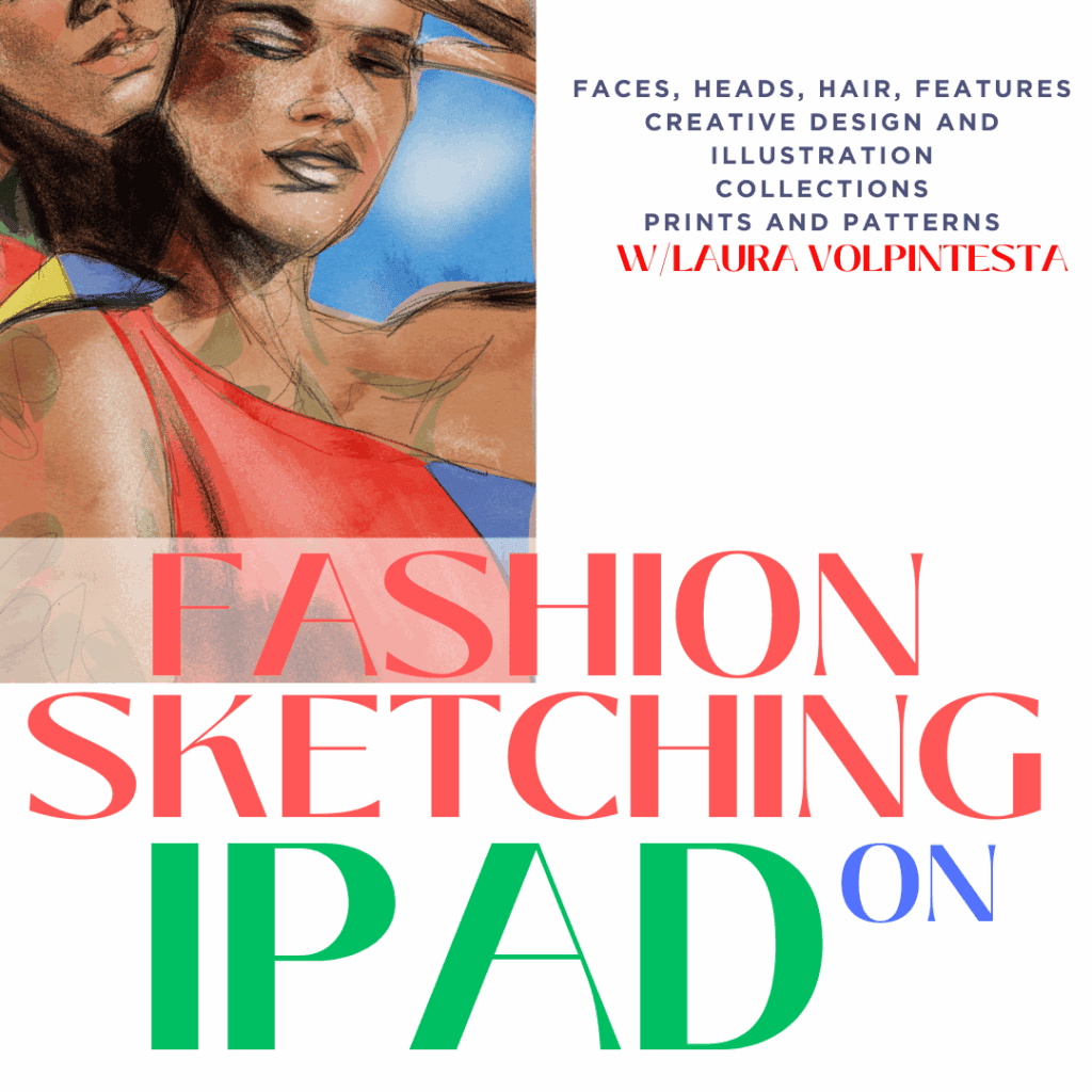
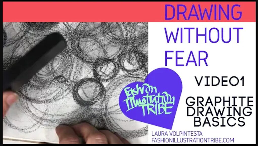
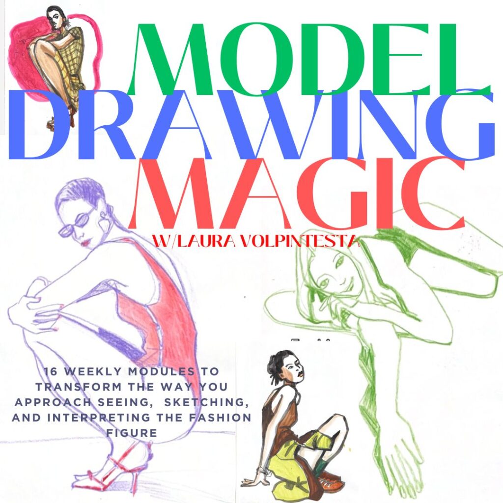
Join me in exploring these concepts in a unique online course experience.
through 24o minutes of video lessons, resources, links, cozy community and instruction.
You can learn to draw faces and express yourself in fashion illustration using your iPad or tablet and elegant, easy digital art apps.
TINTED PAPER RESOURCES for all budgets that I love:
- newsprint paper
- brown paper bag or mailing paper
- ‘Mi-teintes” textured pastel paper (takes watercolor and other media well!)
- “fashion sketch pad” by Bee is richly textured, recycled, toned paper.
- Strathmore Toned Tan or Toned Grey recycled paper (it’s SMOOTH though- I like texture)
- Tayasui Sketches app for Mac or for Windows offers textures and colors for paper choices.
- take any white paper, slightly color on it with graphite, then smudge the whole thing :0) AND, then you can use an ERASER for whites and highlights on the grey ground!! In fact. at that point you could use the eraser as your drawing tool!
EXPERIMENT
BELOW: Strathmore Toned paper pad, grey.
HAVE FUN, fashion illustrators!
xo
Laura