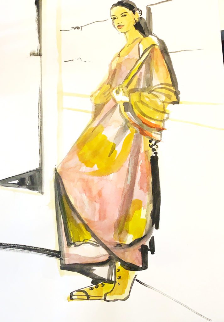
Today, a fashion illustration tour.
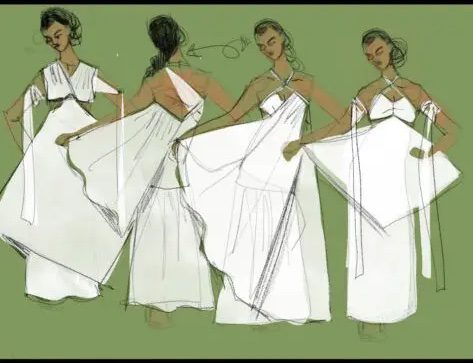
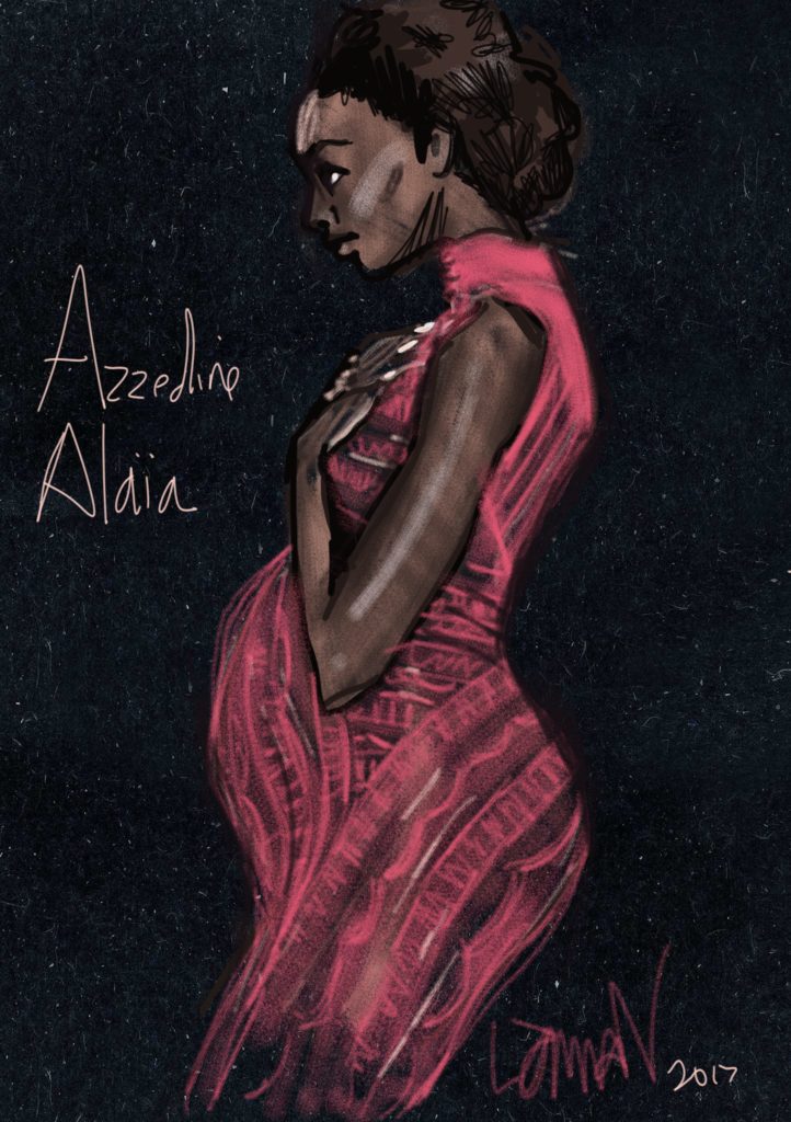
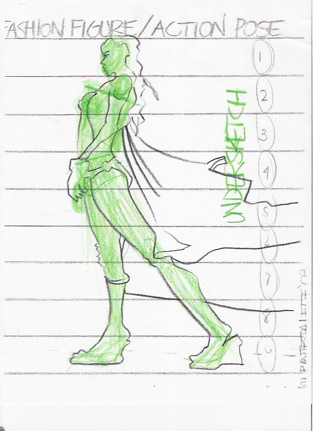
Especially in fashion, but in all model drawing, we focus on…. the model.
Of course!
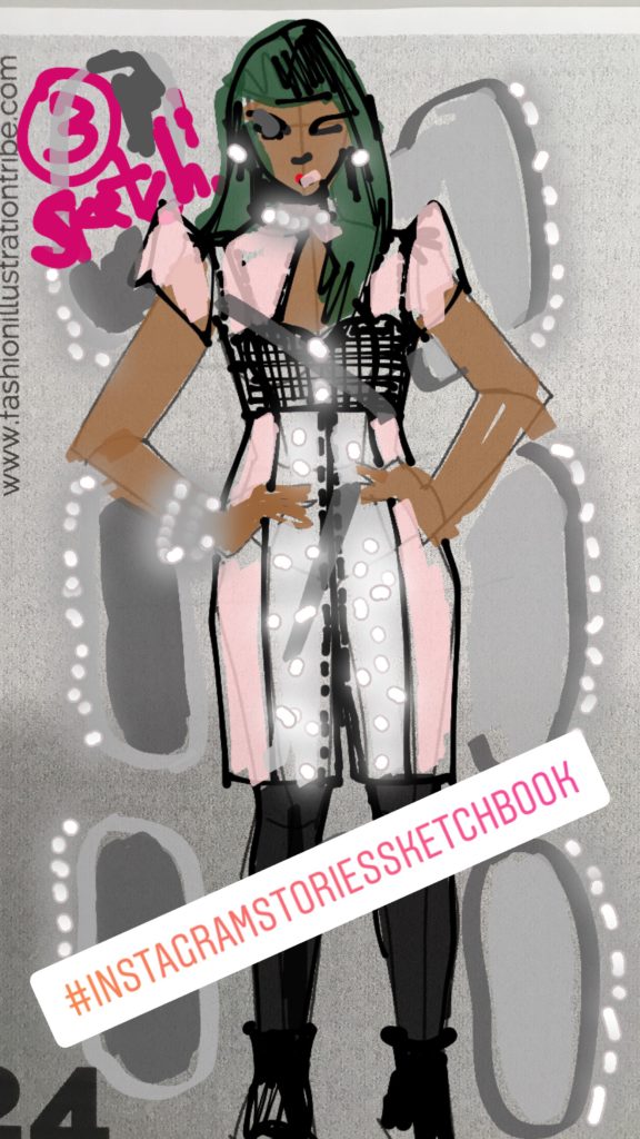
But, lot of the time this can turn into a figure just “floating” in the center of a white page. Once in a while this can work. It works. But, as we journey deeperr, let’s go get richer and more complex.
What about the background of your fashion illustration?
In most cases, I’ll give more attention to the model than to anything else in the picture. That’s my style, with the fashion illustration layout. The model and, well, THE CLOTHES!
BUT there are exceptions, and also just developing your own awareness of fashion illustration layout options will help you make YOUR decisions and style choices.
1. Fashion Illustration Layout: HORIZON LINE
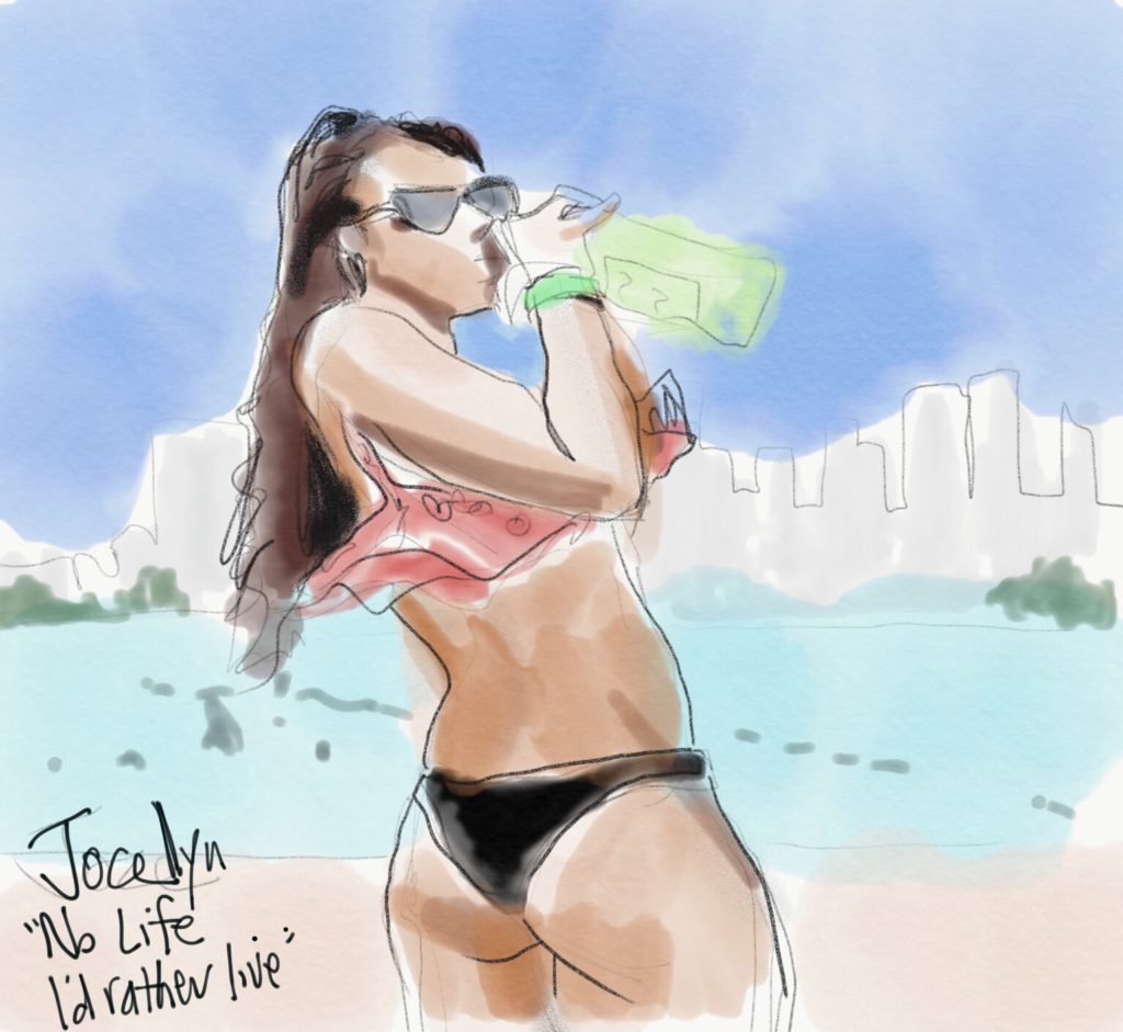
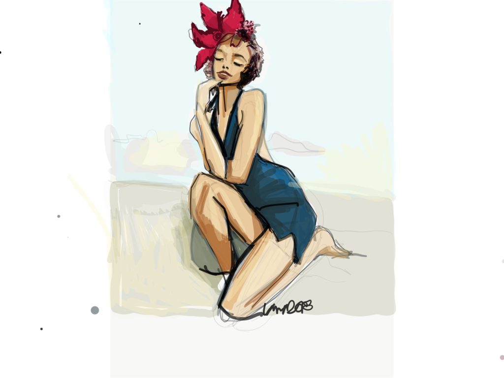
There’s always a horizon line, even indoors. If she’s outdoors like this model, it’s easy to see that horizon line. The horizon line is usually INTERRUPTED by the model, so there is a sense of layering where the model interrupts the horizon, and this creates a great dynamic ! It also creates physical space where the model is in front, and the background…. is behind her.
2. Fashion Illustration Layout: Vertical lines
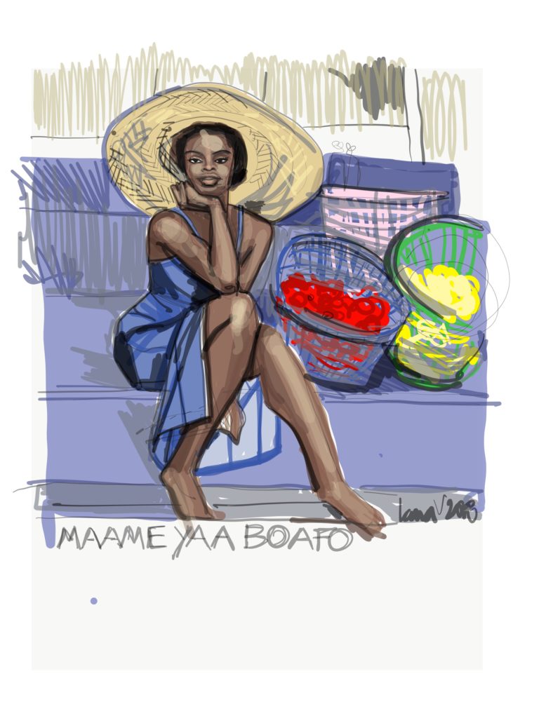
Especially in interiors but also outdoors, you’ll notice columns, staircases, or perhaps corners where walls connect, or even trees and things that add to the background.
You can include them very simply, vaguely, or with more detail. BUt look for them, and see how they interact with your model.
This example includes a vertical in the background, as well as many horizontals in the steps she’s sitting on.
3. Fashion Illustration Layout: Architecture or landscape
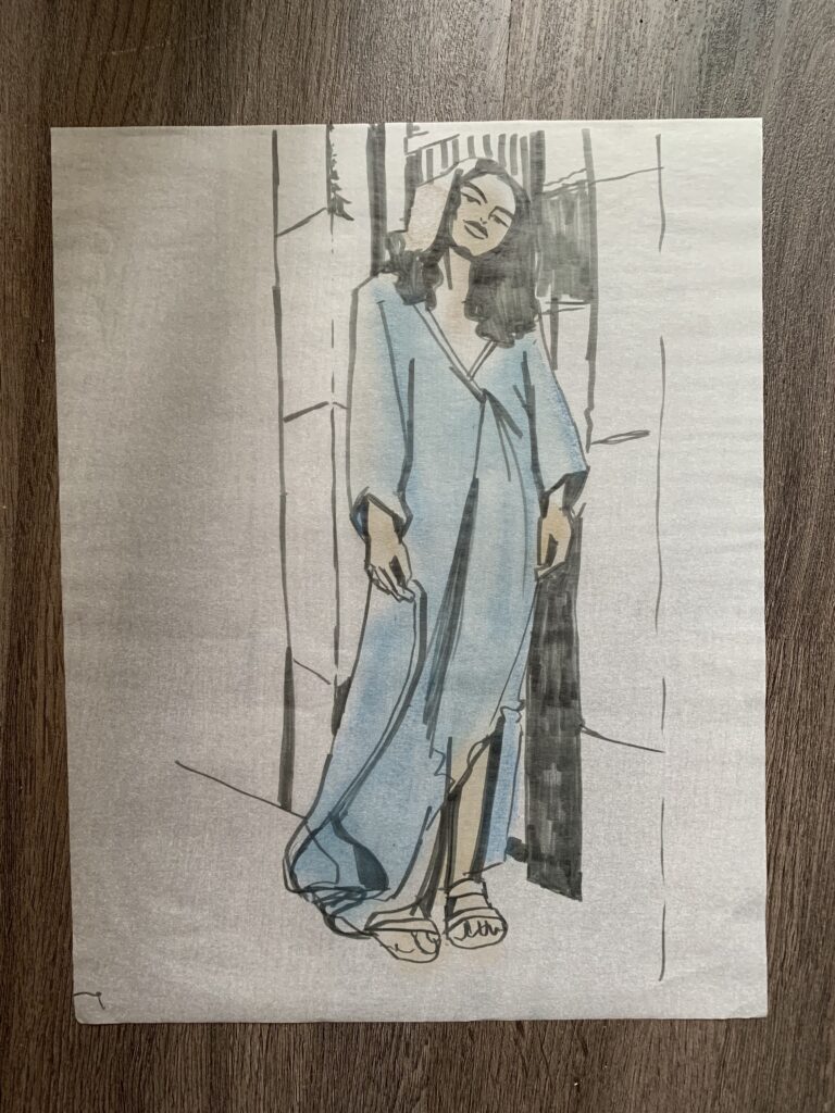
4. Fashion Illustration Layout: No contrast
Another options is to draw everything you see with EQUAL EMPHASIS (example, below). Here the model was wearing a fine printed top and a bold printed bottom, standing in front of a mural in a city.
I decided to play up all of the colors and patterns for a purposeful sensory “overload” … because I love that!
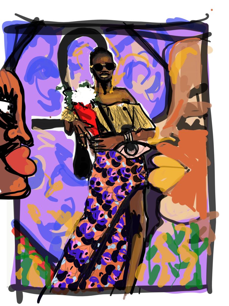
Some interrupted shapes in the background and some strong black lines helped bring the model drawing forward of her background which was flat and had horizon or vertical architecture lines!
5.Fashion Illustration Layout: Shadows
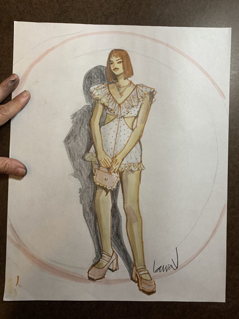
6. Fashion Illustration Layout: Interaction and Relationship
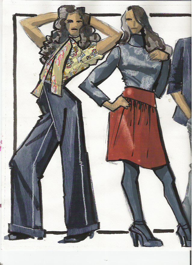
In this example, below I have two figures on the page.
I love when they overlap slightly, but in this sketch I played with the negative shapes BETWEEN the figures and their social interaction instead of overlapping each other.
To create layers of space, I put them IN FRONT of the black-line page-frame I drew in. This kind of framing works so well for Fashion illustration layout!
Check out my Fashion Illustration and Fashion Design Courses in the Menu Header or here.
Adding fabric swatches to this page also adds more depth:
-
- the fabric swatches are in front of the fashion sketches, the sketches are in front of the frame. 3 layers or more, right there!
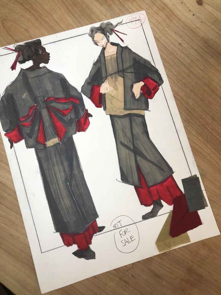
(Not to mention the layers of clothing they are wearing. More ways to create space on the page… notice each model has a foot in the front of the page, and another foot in the back…..]
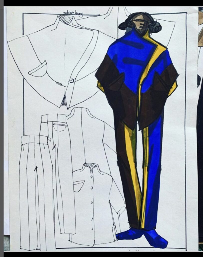
Also, If I do a fashion sketch of a single model, I’ll add the flats to the same page and let them underlap the main figure a bit. Lots of fun to work this way!
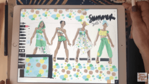
7. Vertical and horizontal
This is a fun example because the model is in the corner and you get both the horizon lines and the corner vertical where walls meet at once.
This also creates some perspective. I did test swatches of my art supplies in the background as I worked, using Procreate app, in a livestream class. Access it here.
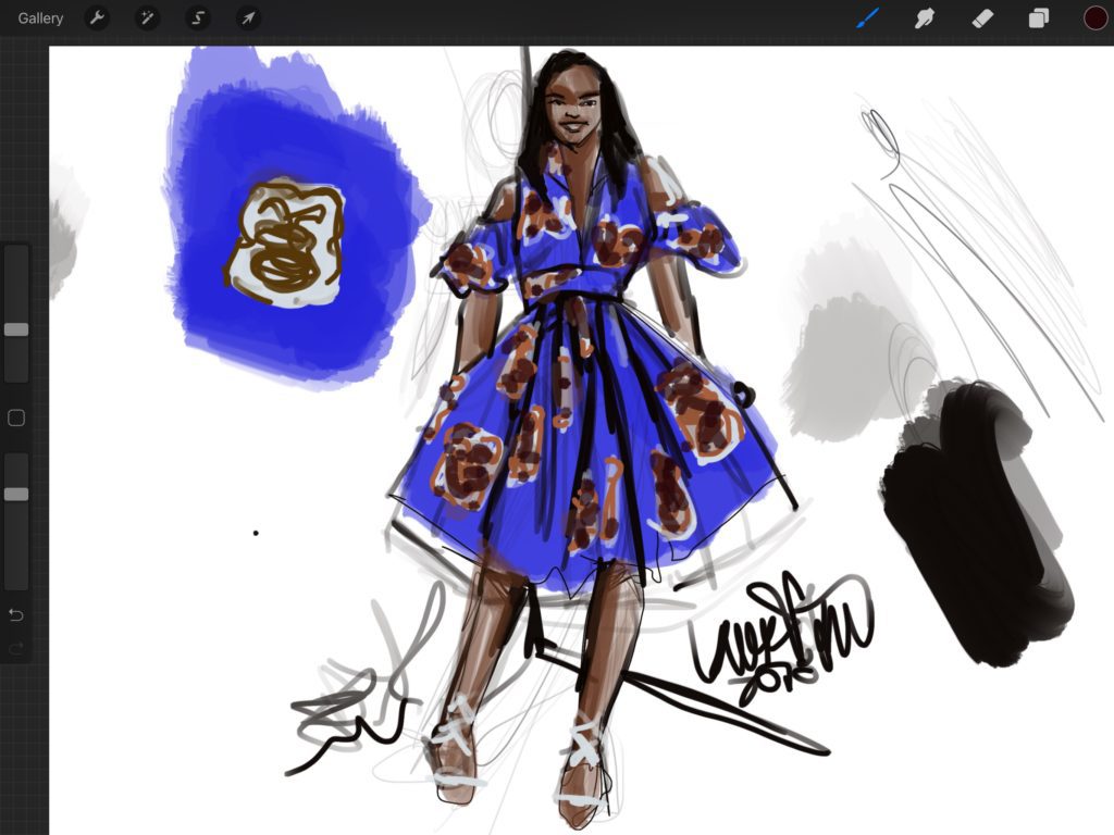
8.Fashion Illustration Layout: Cropping
In reality, we are always cropping. Every picture you saw today was cropped.
IN cropping we are making decisions about where the image begins and ends.This is such an exciting decision to make when creating fashion illustration layout!
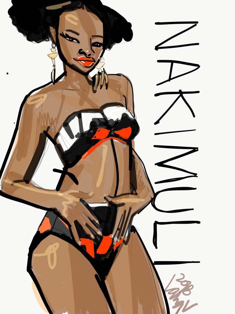
And, while sometimes we make that decision before sketching, drawing, painting or photographing it can also be an awesome way to interact with your work after you are done. Sometimes cropping is THE magic touch that absolutely brings the piece to life.I used Adobe Draw app (now called Adobe Fresco) to create the illustration above, She’s cropped (all of the other figure drawings and model drawings here were full figures in the middle of the page boundaries.
So, in this image, the page is like a window, and the model is “behind ” those boundaries. In another way of thinking about it, she is “larger than life“, exploding off of the page. Certainly, she becomes the most important thing in our vision!
The designer’s name in the side is BARELY overlapped by the figure, (see the letter “U”) putting her in FRONT of the name Nakimuli.
9. Layout is Composition… is CONTEXT :
Layout, the map of your page, s really such a major part of what drawing IS. It’s the CONTEXT you put your subject in.
I mean emotionally as well as “design-wise”.
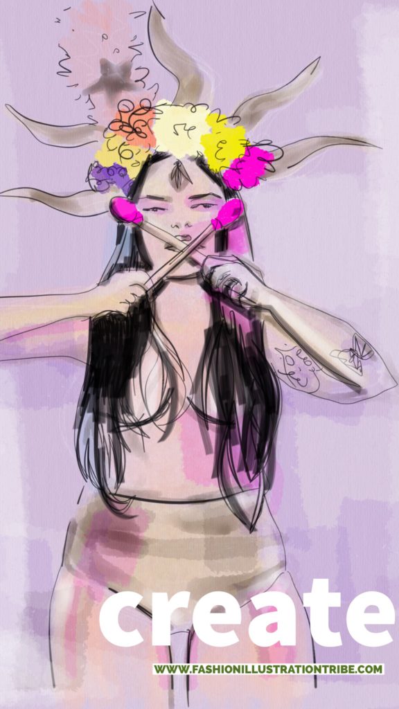
10. ANCHORING the model with a shape or colored ground
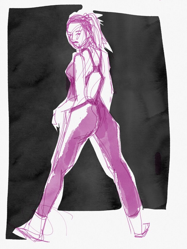
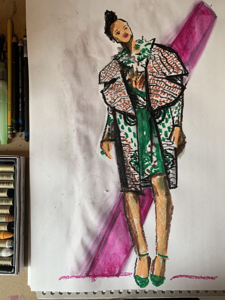
This shaped in the background locks the figure into a ground rather than just floating in the white space of a page.
Today we scratched the surface with just a few starters to get you thinking more about composition in model drawing, art, and figure drawing, but there will be much more to come.
WHAT WILL YOU DO with your new discoveries??
Don’t forget to subscribe for more.
And check out my other articles, courses and resources on model drawing, figure drawing, fashion illustration, gouache, ipad illustration, and fashion design….
My courses can be done as self-studies, or combined with a coaching package 4-8 weeks to support your journey. Contact me at info@fashionillustrationtribe.com or via instagram for more info!
What are YOU working on these days? Let me know!
Love,Laura


