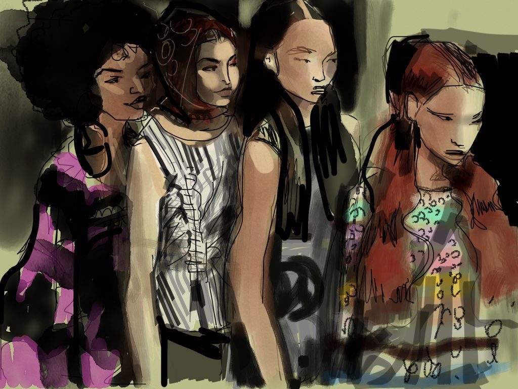
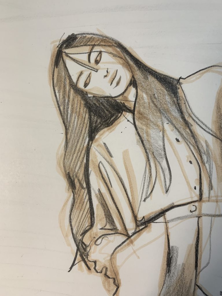
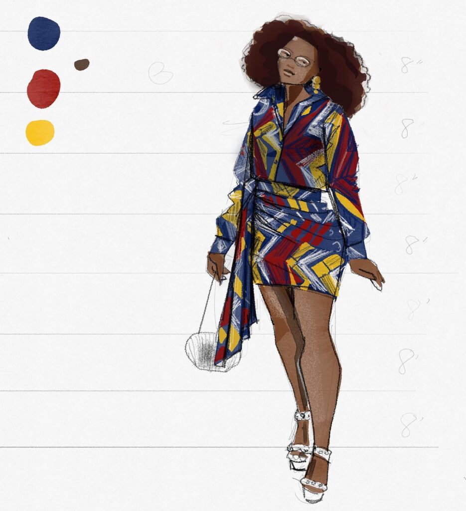
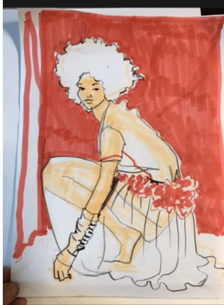
It’s your day to discover TAMARA DE LEMPICKA.
Yes, it’s more of the usual. I wanted to throw a few instructional/inspirational pics up for you, and fell down a rabbit hole of art and women’s history!
I’ve been wanting to pique your interest in the artist Tamara de Lempicka, and walk you through the effectiveness of shading in her work as an example of some of the techniques we’ve been talking about in my SWATCHES TO GOUACHE Masterclass Series Fashion Program, all the while inspiring you with the lush, rich images and reminding you how high you can soar with your image-making and how joyful it feels just to SEE and EXPERIENCE art, let alone create it.
To remind you that while Photoshop is cool, that doesn’t mean that hand-work on paper or canvas will ever have to go out of style………its richness and quality stand alone.
TODAY I STARTED TO LEARN MORE ABOUT TAMARA DE LEMPICKA….
Born Maria Gorskaw in turn of the century Warsaw, Poland , emigrated to Paris in 1917, then New York, then Connecticut, Texas,and Mexico over the course of her life. I read about her marriages, motherhood, exhibits, cities, artistic development in each decade of her career, and then it just became overwhelming to type up a simple article. WHAT AN AMAZING WOMAN TAMARA DE LEMPICKA WAS!
The link above takes you to the page of the website devoted to her work, and sorts the works into segments of years in her career, which you can see.
The “height” of her career and the work she is known for is in the 20s and 30s, but I also adore seeing how she started out in her early works, as well as how her work softened both in tones and edges, later.
The biographical information at that link is also so interesting. PLEASE visit and share, for a real museum experience with thorough information. I STRONGLY RECOMMEND READING THROUGH THE WEBSITE, like a good book!!!!
Meanwhile, I’ll stay on -task
by showing you a sampling of her work as it most relates to fashion illustration, (which I was turned on to at some point by either a teacher or a designer I worked with, I can’t remember any more. )The website is a slower read showing many more pieces for each chronological segment of her career.
With each piece we look at, I ‘ll point out some really useful aspects that you can apply to your fashion illustrations that relate to the methods that I recommend to help you clarify the details and 3d forms in your fashion designs, model drawings and illustrations.
MOST OF THE IMAGES ARE AT THE BOTTOM SO SCROLL AWAY IF NOT IN READING MOOD!
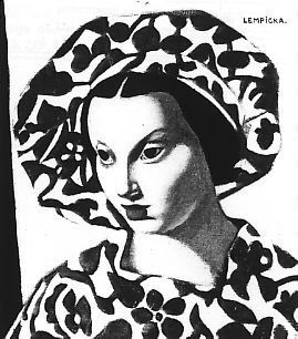
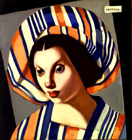
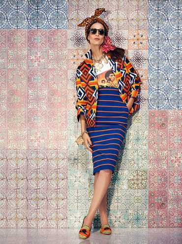
These two “Young Lady with a Beret” pieces (above) are so on-target with the times right now with the graphic, African influenced prints, colors, and stripes, like with the great new collection by Italian designer Stella Jean, (above right, spring/summer 2015) of Italian and Haitian descent, bringing together Italian stripes and suiting with African print and mixing sensibility.
From Tamara’s early career, I found this 1920s fashion illustration…very atypical of the style she became known for.
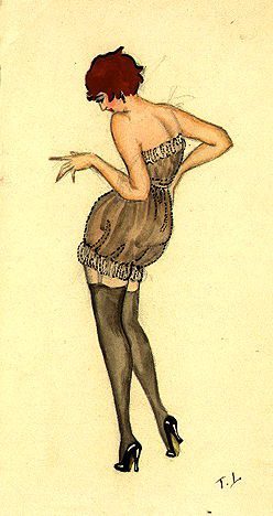 but–notice the strong S-curve, the perfect workings of the balance line, and the movement through the torso, with the pelvis tilting one way, and the ribcage tilting the other way, resolving the movement. This is something we been practicing a lot in model drawing class.
But below, is the really classic Tamara de Lempicka stuff.
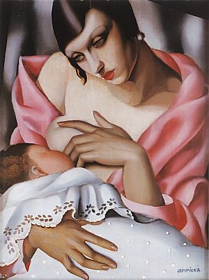
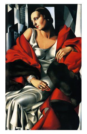
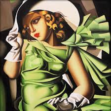
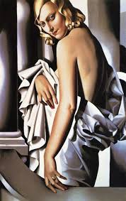
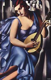
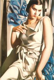
Sculptural. Bold. Stylized, Luminous. Crisp. Zoomed-in.
Look how statuesque the images, how strong the impact of shading and form, how grounded, solid, and still the models are.
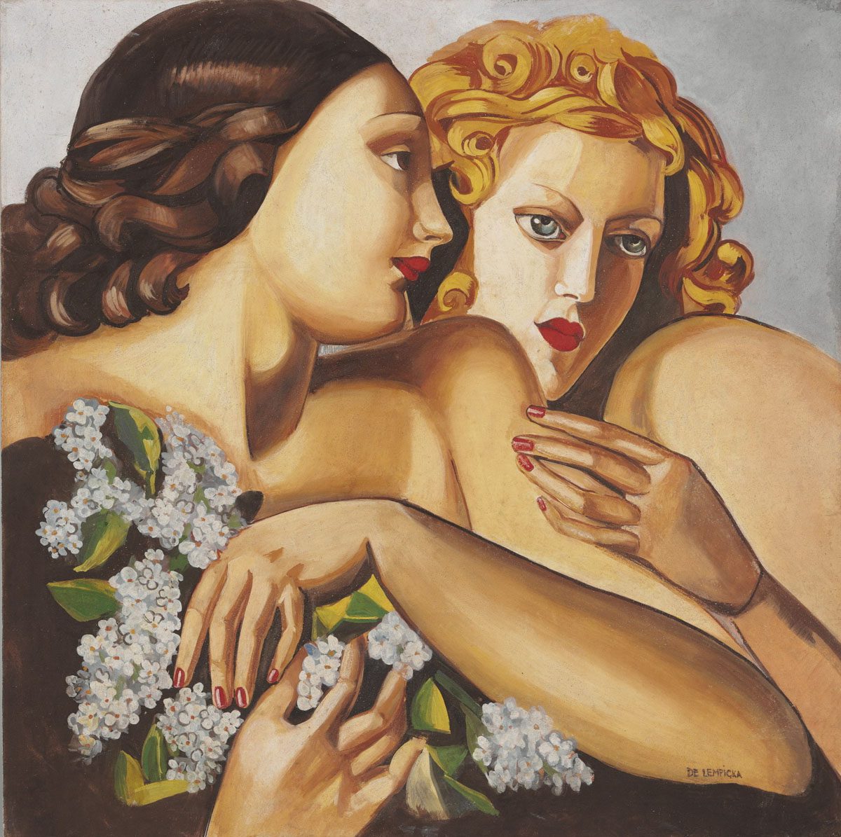
I particularly like to point this one out as a study of hair: to remember you can capture the hair as a solid shape of flat tone, and then add some shadow and light for the texture or shapes. This takes away the straggly mistake of drawing all of the individual hairs. This hair looks great, doesn’t it?
Also notice the interaction of the forms…. in a “cool” way that is her signature style , the women are not so intimately engaged emotionally, but they are interacting on the page, subtly. Notice how she chose to crop what she was looking at for a graceful, balanced composition.
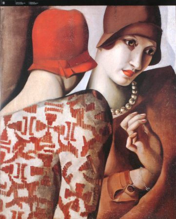 Tamara’s studies of hands and fingers in all of these images are so interesting.
Strong, deep, high contrast of shadow helps separate the fingers from the palm, or the chin from the neck. In the white skin of this face, it is very obvious how she used black to shade (a wink to my students out there!!! ;0).
Zoom in here to notice the shading that creates the roundness of each pearl around her neck!
The pattern is rendered fully and would-be flatly, but then the shading between arm and ribcage separate the forms.
Remember when you are shading from your head (imagination) , and not from a model or photo, that an easy rule is to shade wherever something is BEHIND something else.
Look at any one of Tamara de Lempicka’s images and count exactly how many times you see this happen.
Whoah, what a fascinating exception to the rule: in the above image, the model’s shoulder/arm edge are shaded to show that they are IN FRONT of the other model.
Exception to the rule!
BOTTOM LINE: Shadow Tone can be used to separate things that would otherwise merge together visually.
Note: Tamara worked in oils, we work in gouache which is water-based and quick-drying media.
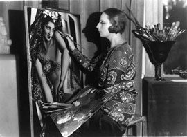
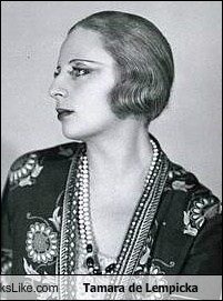 Here is Ms. Lempicka in the flesh, an icon herself!
Drapery Rendering:
Black added to the garment tone creates the depth in layers and ruffles. Black creates the shadow under the rim of her hat (I have a few students who are milliners!!! wink/wink!;0)
Notice shading on the hair
which is BEHIND her head, as opposed to the hair that surrounds her face. In addition to shading on hair or dress or hat, very white or light tones are ALSO used for a POP that brings things FORWARD. This mid tone, highlight, and shadow tone technique makes her work POP like a sculpture in a spotlight. Do you agree?
Some of her edges are clean and harsh where light meets dark , like on the hat, but other edges are “airbrushed” and soft in appearance, like on the arm. In gouache illustrations, we get a more flat edge between tones.
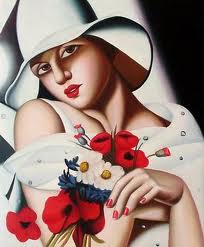
BODY LANGUAGE
I am always moved by the expression and language of attitudes of hand, tilt of head, shoulders, body language. As we all are in this line of interest, right? It’s an unspoken language that we speak in model drawing.
Notice the CONICAL forms here.
This is perfect for drawing flares, created by curved and circular forms of fabric falling with gravity. If you struggle with flares, as I did for a long time, consider drawing, tracing or copying what you see on this white painting as an exercise. The image at the right is more of what we call “cascades”which are vertical rows of flares, rather than horizontal.
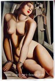 I’d love to see more bodies like this in fashion magazines. It’s really hard to understand why there would only be one body type, skin tone, age or size in fashion magazines, if they are intended for the public. The way I figure it, if I’m not in them, then they aren’t “for me”. The great news is that you can search and find your own niche for fashion online now and no longer need to be dictated like before. I LOVE IT!!!!!!! Instagram… Google….Pinterest…… oh, my!!
Here’s the Almighty Cowl Neckline in action, also a tied waist, all perfectly rendered by drawing the edges where they are, then paying attention to where light and dark lie to separate layers from each other.. Also notice the shine on the hair, … and the shading on face…all good examples to pull inspiration from.
Okay, I’m going to step out now, at 1200 words, and share more and more images, then also share a link to my new youtube videos discussing art and learning in the fashion realm and beyond.
Thank you, as always, for your generous time. I try to return the favor with juicy wonderfulness for you :0)
Love always,
Laura
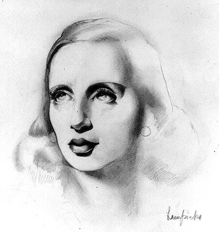
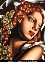 Look at the spherical forms and curls!!!!! Look at the mouth, the shadows that form it, and the 3/4 angle of the face my loves!
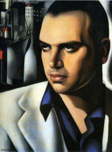 Her husband. Another 3/4 face rotation.
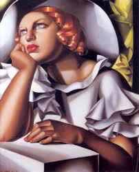 The flared, ruffles of these sleeves would be flat wide circles if laid flat. Notic the shading under the neckline edge showing the separate layers of the dress, along with more cascading ruffles.
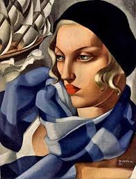 There is a wooly, soft, wintery mood, texture, and color to this image. I usually use colored pencils over gouache to emphasize this fuzziness.
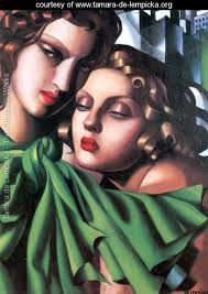 More circular flares…. look at those conical forms, and how they’re shaded with black plus the color– across the surface as well as under the edges!! You can do it too!
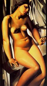 Even without clothing, the body says so much.
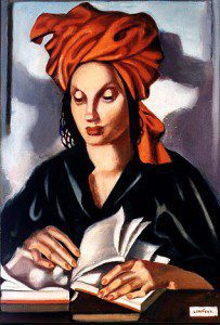 !
!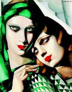 Everyone knows I love turbans, so here are two for your enjoyment.
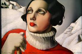 I hate to look at winter in the summer, but here you go… a ribbed knit neckline… notice the bend and roundness of the ribs, and the thickness in the round edges. And as far as contours go, just follow the right hand edge of her hair, neck, collar, …… what a beautiful study. While again, the blackest shaded edge is in front of a light background, using high contrast to give “POP” form everywhere.
I hope I’ve sparked your interest and helped you feel aligned with the great masters, which you are.
….and here’s the link to my new video on art development and learning environments.

