Watercolor Fashion Portrait Process
The purpose of this watercolor fashion portrait is to get you excited to create.
I hope it makes your fingers tingle, your heart beat, and your eyes remember that you have visions- and grab some paper or your iPad or anything, even a napkin and a ballpoint pen, and bring something out into the world.
Watch my time-lapse process, right here!!!
For this one, I went onto Pinterest to find an image,
I think.
Three places I love to sketch from for watercolor f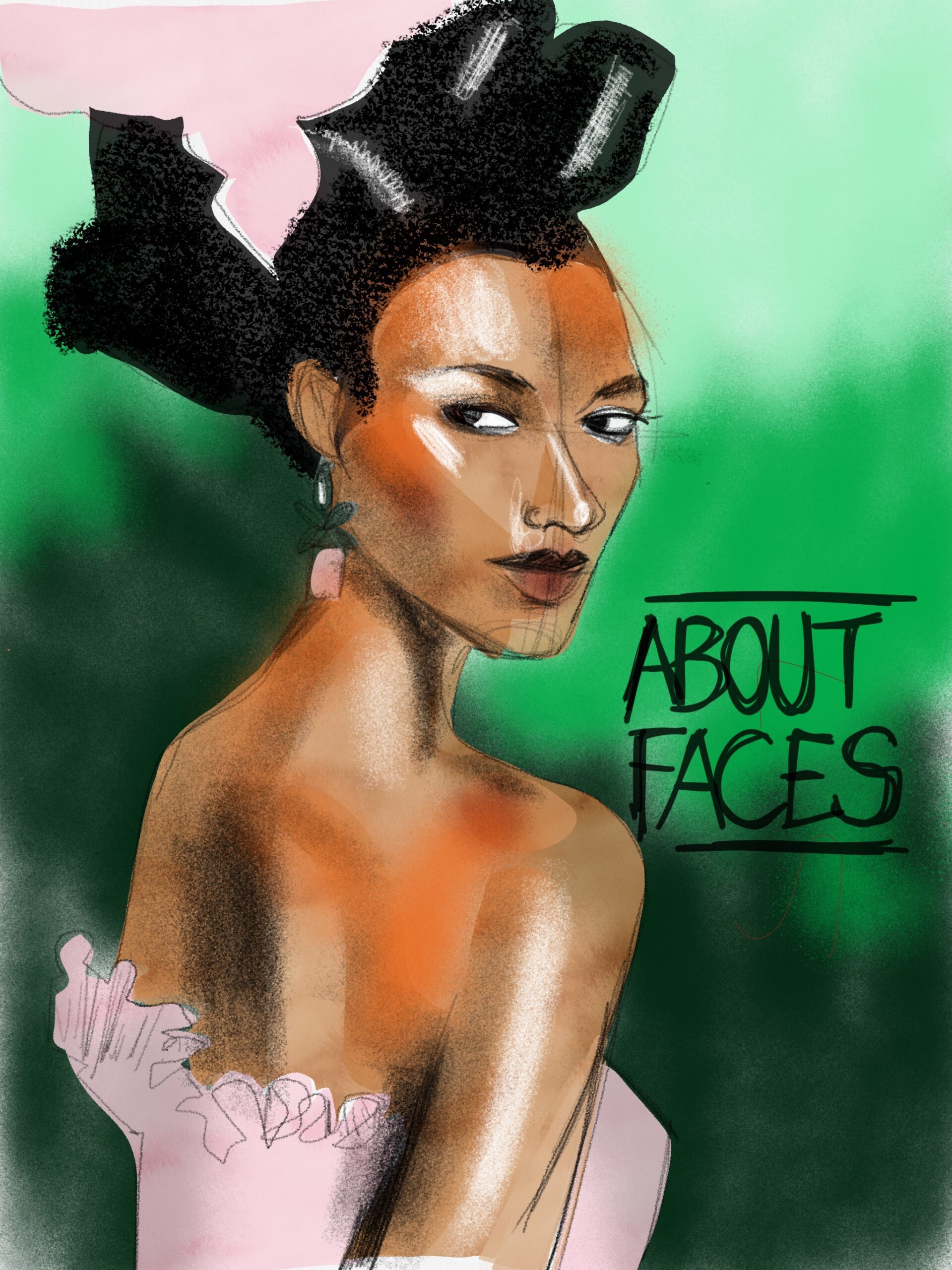 ashion portraits and illustrations are Pinterest, Instagram, and Firstview.com.
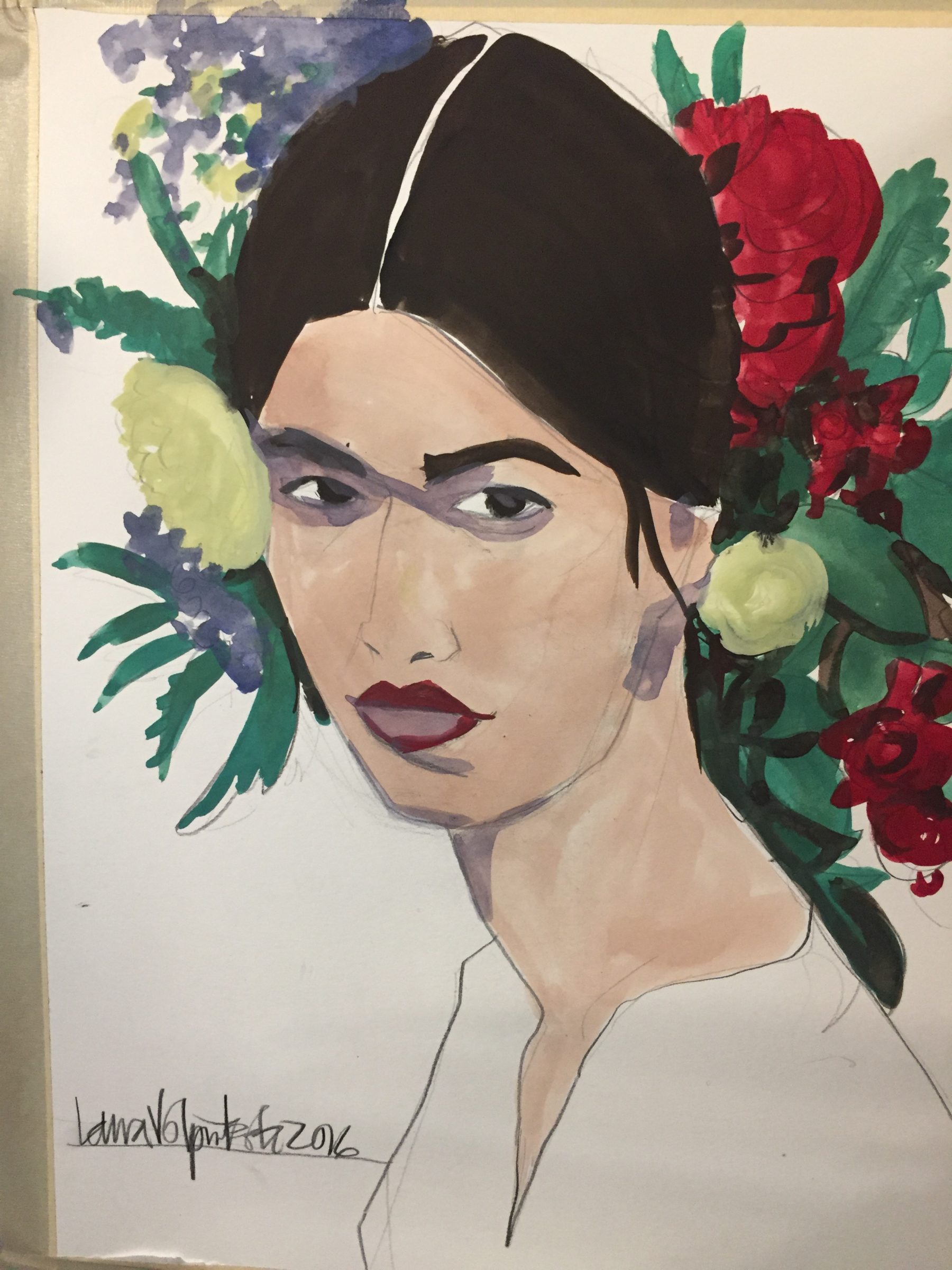
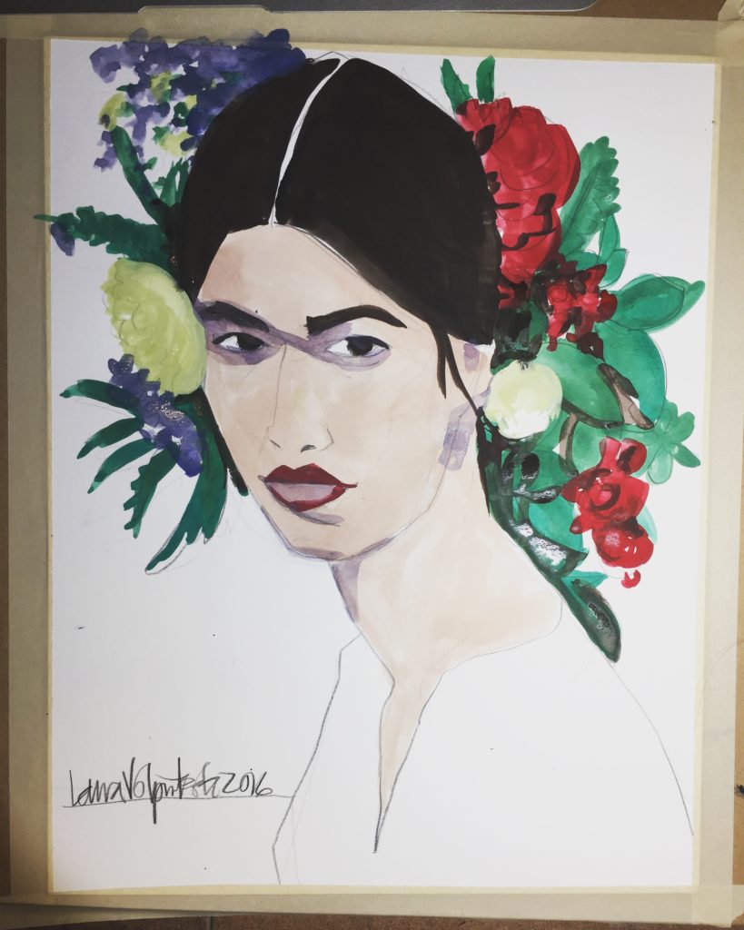
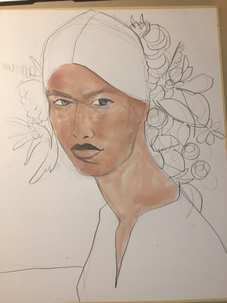
This is a backstage image from a Dolce and Gabbana show. I loved the face and the flowers so I first picked up my ebony pencil or woodless soft graphite, and plotted out the face softly with a very light touch.
As I got more confident about the placement of things, I got darker with my lines and captured the major shapes.
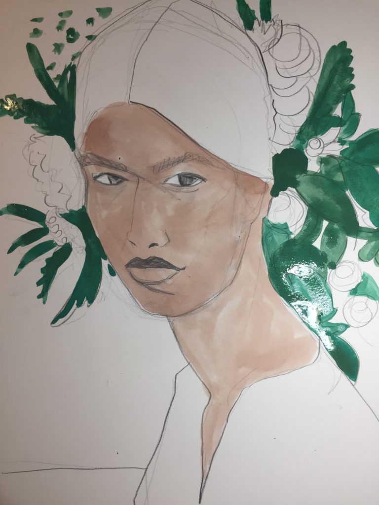
In most everything I do, I start with the squinting. Here I used a Cotman watercolor box and mixed the brown with the white (they are side by side in the box) and mixed them to get the skin tone.
The paper is Fabriano Hot Press Watercolor paper, size 11×14. I used a round size 8 watercolor brush to create this watercolor fashion portrait.
You can below see the skintone is very uneven.
Yes ! While I think of it as a “flat tone” when I say it down, because it is a single color,….
The unevenness of it makes it so alive and organic in feeling. I adore. that. I laid it a little heavier next to the hairline, I can see that. I’m not sure why. Perhaps her hair was casting a shadow.
I also filled in all of the greenery with a flat single tone of green, too.
Learn gouache techniques in Freedom Fashion Intensive!
After I filled in the red flowers
(and added black or blue to the red to add shadows to them so they wouldn’t look flat) and the blue flowers, there was a purplish tone remaining. I mixed it with the squinting and used it to plot out some very simple shadow shapes around the eyes, under the ear and chin, mouth.
Shadows recede and bring the other parts of the face forward, creating layers of space on the page, and dimension. The flowers being placed “behind her” face also create another layer of depth.
The flowers that are cut off by the edge of the paper also create a layer of space, as if she were sitting behind a window.
I intended to take this so far: I was going to add white highlights into the black hair (which is totally flat here) and detailing and shadow on the shirt (which is pure white here and no paint at all). I was going to pencil over the edges of the flowers and leaves and paint a tone into the background.
But when I got to this point, I came to a screeching halt.
I loved her. I KNEW I had to stop, RIGHT THERE.
Sometimes you just know. Often times I keep over working an image.
The simplicity of this one portrait, and the expression and composition of it, will always charm me.
I ‘d love to know your insights, experiences, questions or thoughts about sketching faces or portraits!
PLEASE JOIN in the COMMENTS BELOW!
My digital course “ABOUT FACES” is all about drawing faces from front, profile, and 3/4 angle, while at the same time learning about digital drawing and painting apps in the ipad/ iPhone , tablet and android.
My FREEDOM FASHION online course teaches all aspects of model drawing, watercolor techniques, design drawing, design sketching, research and illustration, fabrics, and so much! It’s modeled after the semester long online course I created for Parsons School of Design during my days on the full time faculty.
The class still runs today! Learn more about it here if you’d like to go deeper in your studies and experience!
as always, love
Laura

