Color theory for Fashion.
I‘m obsessed.
Right now I’m loving pale pale pale tint of pink (which I never would have worn years ago), alongside royal blue, and mint green. Lemon yellow.
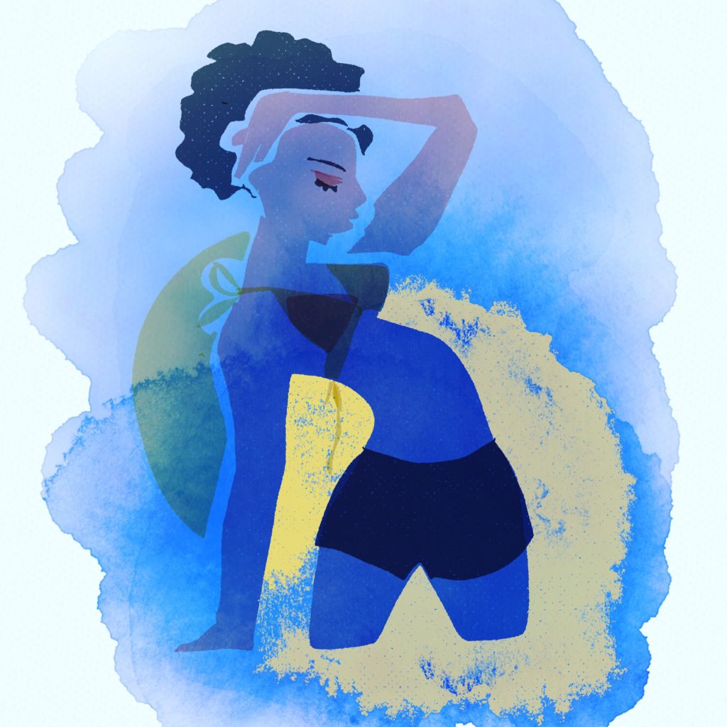
I love pastels and pure primary hues when paired with each other or mixed with white. These colors and combinations give me a feeling of lightness and purity that makes me feel new and energized.
WHAT IS COLOR THEORY?
Understanding color theory for art and fashion, helps us to:
- understand how to CREATE, use and mix the colors we want
- understand why color behaves and effects us the way it does
- gives us a common language and vocabulary to DISCUSS and COMMUNICATE about color with others
- introduces specific concepts, structures and experiences to build awareness of color’s mechanics, associations and emotions
- helps us to analyze what is HAPPENING in color situations and environments
- helps us to be specific and conscious of what is happening in terms of color in any situation.
- empowers us to use and manipulate color intelligently for what we need in design
What colors are you obsessed with right now?
Make a list. Or a mood board.
WHAT IS COLOR TO YOU?
Make a list.
Here’s mine.
Color is joy.
Color is a public service.
Color is happiness.
Color is emotion, feeling, mood, and energy.
Everybody craves color.
My students usually have such emotional conversations when the fashion we’ve designed or are discussing uses color.
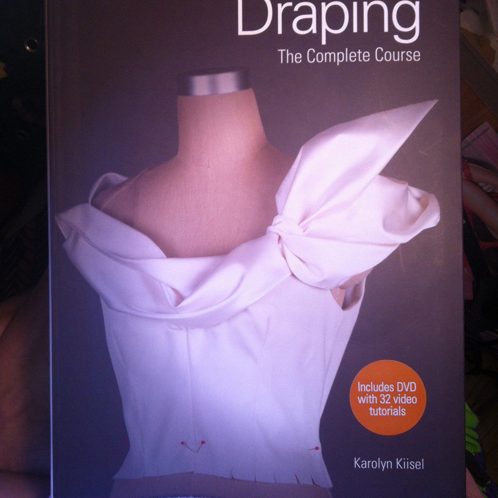
I just received my review copy in the mail of Marcie Cooperman’s now-famed “Color: How to Use It”, so I thought I ‘d take a moment to tell you about it!

As I sit here to type, the usual issues come up:
A flood of topics, feelings, ideas, images, MEMORIES,and discussions about color come up when I start to think about COLOR AND FASHION
Now that I can’t recomment this book anymore, check out Yale University’s new version of Josef Albers standard iconic Color Theory text “INTERACTION OF COLOR”

THERE IS SO MUCH I WANT TO SHARE WITH YOU about color in fashion!!!!!
Have you ever studied color theory at all?
If you’ve enrolled in any fine art or design program, you probably have. In recent years, it’s been removed from the curriculum at Parsons to make room for computer classes and I really feel it leaves students at a disadvantage to be missing this sacred knowledge.
FASHION DESIGN EDUCATION: PARSONS
When I was a fashion design student, my color theory teacher was a dud (oops, sorry!), but to this day, I am FLOORED by how Color Theory changed my life. I am NOT kidding!!!
And any decent color theory course will in fact have that effect.
If you didn’t have such an experience, then it’s worth looking into a good color theory board.
If you read through the whole book you can really have a blast feeling your eyes change with each exercise. (This is probably best done with a great teacher beside you or a friend who understands the process to do the book with).
When I was in school, it was Josef Albers’ Interaction of Color, which was pretty a dry paperback.
I DIDN’T LEARN FROM THE BOOK.
I LEARNED FROM THE ASSIGNMENTS!

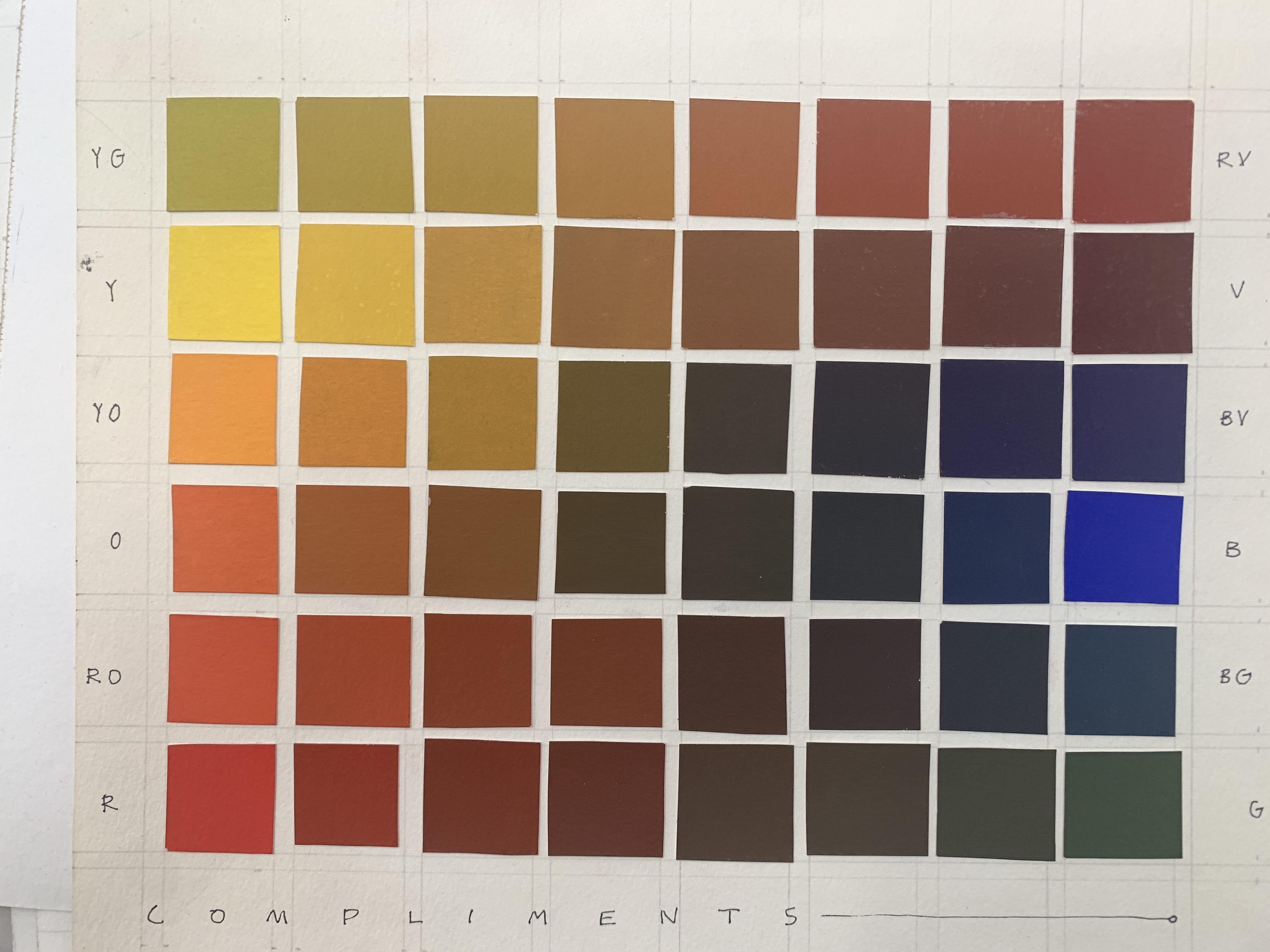
You can see how “dry” it could be.
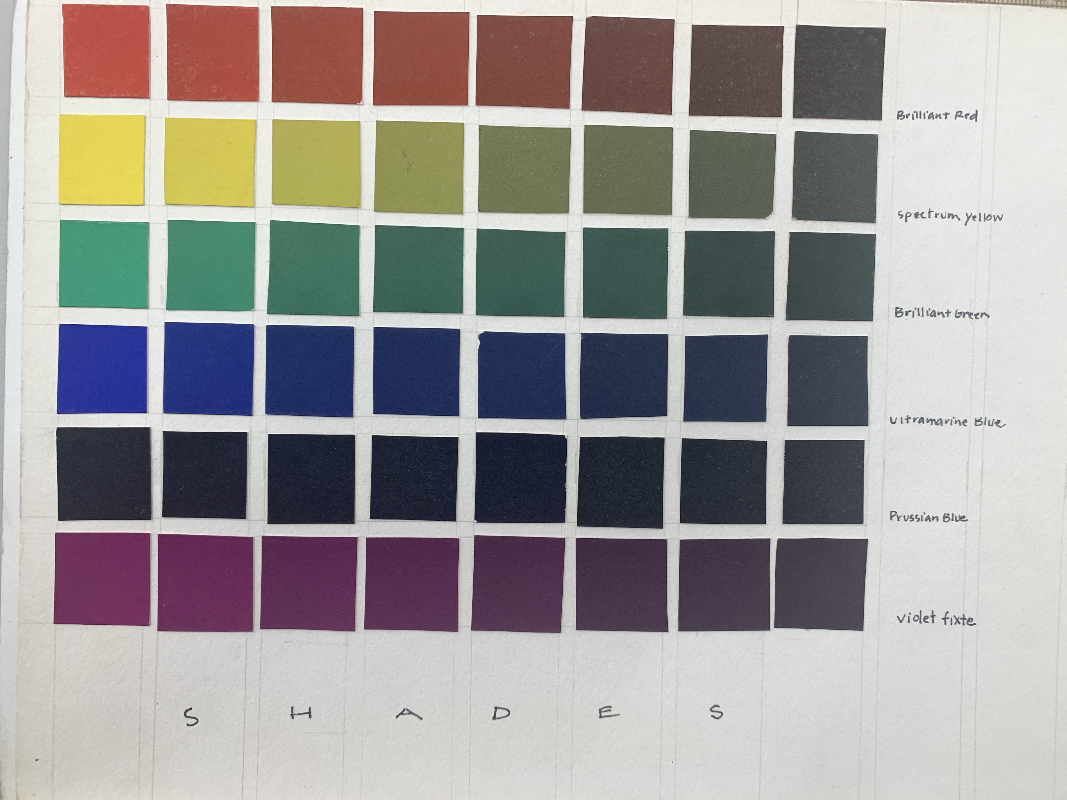
But take a close look at the image you see there. See the brown box inside the blue bar at the top?
See the brown box in the orange bar at the bottom? Okay.
Guess what?
They are both the same color brown boxes.
I know you don’t believe me. BUT IT’S TRUE. Don’t worry, I will explain!
Colors can not be purely perceived when they are near other colors.
They “change” in reaction to the colors around them. OR at least, our PERCEPTION of them does. This is caused by the way we see.ANY ARTIST OR DESIGNER CAN BENEFIT BY DEEPLY UNDERSTANDING AND EMBODYING, EXPERIENCING, and HARNESSING THIS INFORMATION.
KNOWING COLOR THEORY
ALLOWS YOU TO UNDERSTAND THIS and manipulate it, use it, to your advantage when you want things to blend in or stand out, visually “move forward” or “move back”
Look at those brown boxes again.
The one at the top looks lighter, because it is adjacent to a dark color.
That’s Color Theory in action.
Look at the brown box at the bottom. It APPEARS darker, because it is placed upon a color that is lighter than it.
Once you experience it, you have all of these wild “a-ha”s that just blow your mind and you can never see the same again!
(and that’s what studying with me is all about :0)))))
But there’s more! (and more and more, I swear I’ll keep this short, I SWEAR!)
For example,
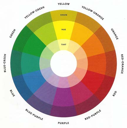
COMPLEMENTARY COLORS
See that little brown box at the top?
It looks “ORANGER” than the brown box at the bottom.
Why? Because it is on a blue box. Blue and orange are COMPLIMENTARY COLORS, opposite each other on the COLOR WHEEL (scroll down to see). Complimentary colors enhance each other.
ASK YOURSELF:
- Which brown square do you perceive as larger or smaller ? (though they are in fact the same size)
- Which brown square do you perceive as closer to you or farther away from you? (though they are both on the same plane)
- Which brown square appears the most saturated, which one appeares more washed out? (though they are both equal)
So, blue appears BLUER next to orange, and orange appears ORANGER next to blue. (and we are talking about brown here, but the orange in the brown is played up by the blue, you see…)
But what about the brown box in the orange area? It looks BROWNER than the brown box above it….
Right. Orange and brown are adjacent on the color wheel… or, rather…analogous colors. They are similar. The brown actually has ORANGE IN IT.
When colors are near colors that are SIMILAR to them, they become less vibrant themselves.
And so, the brown next to the orange is LESS ORANGE than the brown at top because, in a way, it just can’t “compete” with the orange around it!!!
And so that’s how it goes with color theory.
Take your index finger.
YEAH, YOU!
PLACE IT OVER THE BLUE AND YELLOW BARS IN THAT IMAGE.
Good. Now you can see that the browns are identical.
I don’t know about you, but experiences like this turn my world completely upside-down.
These are the simple truths that make life so thrilling when you start studying art and design!
THE CULTURE OF COLOR
When I was 20 years old I moved to Paris to study fashion design for a year at Parsons Paris.
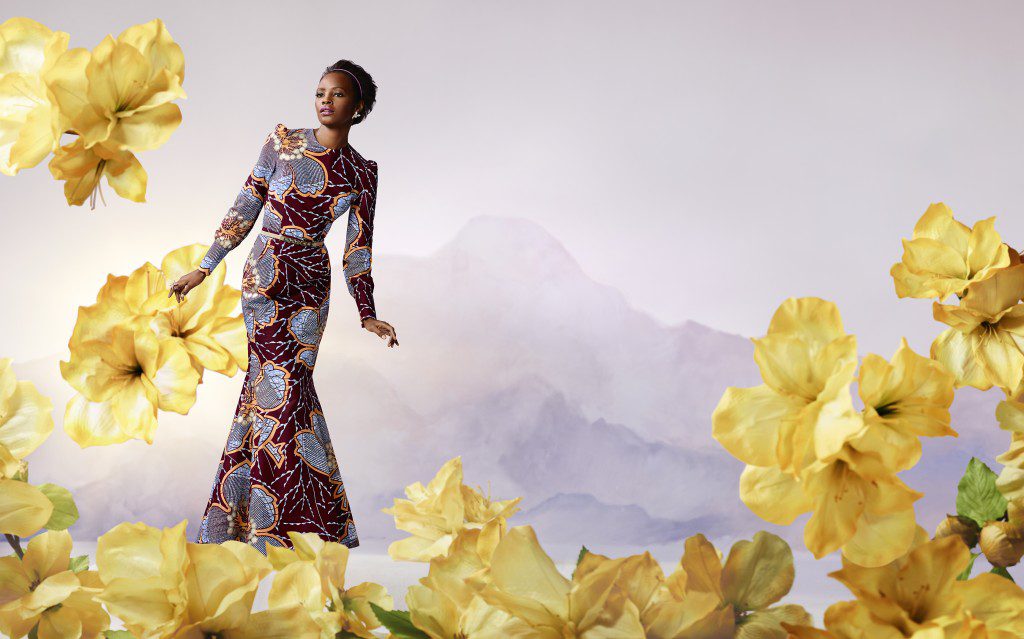
I my mind was blown when I saw the African fashion and the African prints. I always tell this story.
It was just so liberating, joyful, vibrant and eye-candy-ifying that to this day it represents the experience I want people to have too.
There was rhythm in the patterns, grand varieties of scale in the print motifs, and grand, sweeping movements of layered shapes, patterns and forms overlapping one another.
The fabrics were crisp , natural fibered, hight quality cotton and appeared block printed like the Japanese origami papers I spent my childhood folding and collecting.
The prints had an earthy, hand-made look and tiny imperfections that made them even more beautiful.
And the colors, oh, the colors the colors! I had the distinct feeling that I was “seeing colors I had never seen before”. (I was also seeing motifs I had never seen before)
Imagine feeling that way? Have you felt that way?
“NEW” COLORS
I was having a new experience of color. I was having a cultural revolution in color!
I realized that I had seen these “new colors” in Issey Miyake’s designs also (I was a close follower of his work in the 80s).
In that moment I realized that they couldn’t really be “inventing” new colors, could they? But in a way, yes.
The color COMBINATIONS were new, so the resulting colors were new, too.
So, yes, your culture is controlling your colors!Sorry to break it to you!! I’m thankful for awareness of the variety across the globe,
But when I go clothes shopping, oh, how I feel it. IT FEELS LIKE MIND CONTROL! I can never find the colors I am looking for.
So I create them by combining them in particular ways, but still, most of the colors I’m looking for seem to be(though secretly), “ILLEGAL” in our country!?
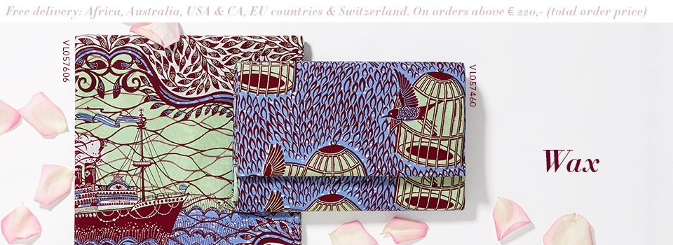 (Vlisco Dutch Wax prints featuring strong contrasts of dark tones agains pastels)
I guess its part of a cultural identity or history.
Either way, be aware of it and notice it.
MUTED COLORS ARE STILL “COLORS”
Colors in our cultural fashion are generally watered down, muddied, faded, paled, or “browned”.
This is easily achieved by mixing brown or a complimentary color (above) into any color you are mixing.
I find it soothing at times, depressing at others. That’s just my personal thang!
DIGITAL PLAY WITH COMPLEMENTARY COLORS
I noticed… my Korean stepmom and some of my students from Korea have a slant toward wearing the most lovely oranges, pinks, and yellows….along with white, and florals…There is a whole story in that color palette that I can’t describe to you easily, but that is very palpable and I feel it so strongly when I’m in its presence. It tells a story to me and feel SUPER -FEMININE!
I noticed… that my Brazilian friends’ use of bright yellow, royal blue, kelly green and white (like the Brazilian flag) colors brought me great joy.

I also that in their clothes I found a lot of earthy vegetable colors that I never saw in the US such as avocado, rust, maize, mud, bronze, …. it’s hard to describe, again, but a strong feeling.
ON GRIEF AND JOY
I also noticed…. that after I had my first baby, I wasn’t able to wear black for a few years. It felt too mournful (and believe me, I used to wear a ton of black!) It was a strong emotional pull that kept me out of black for some time!
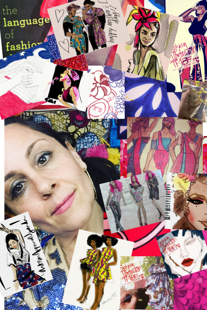
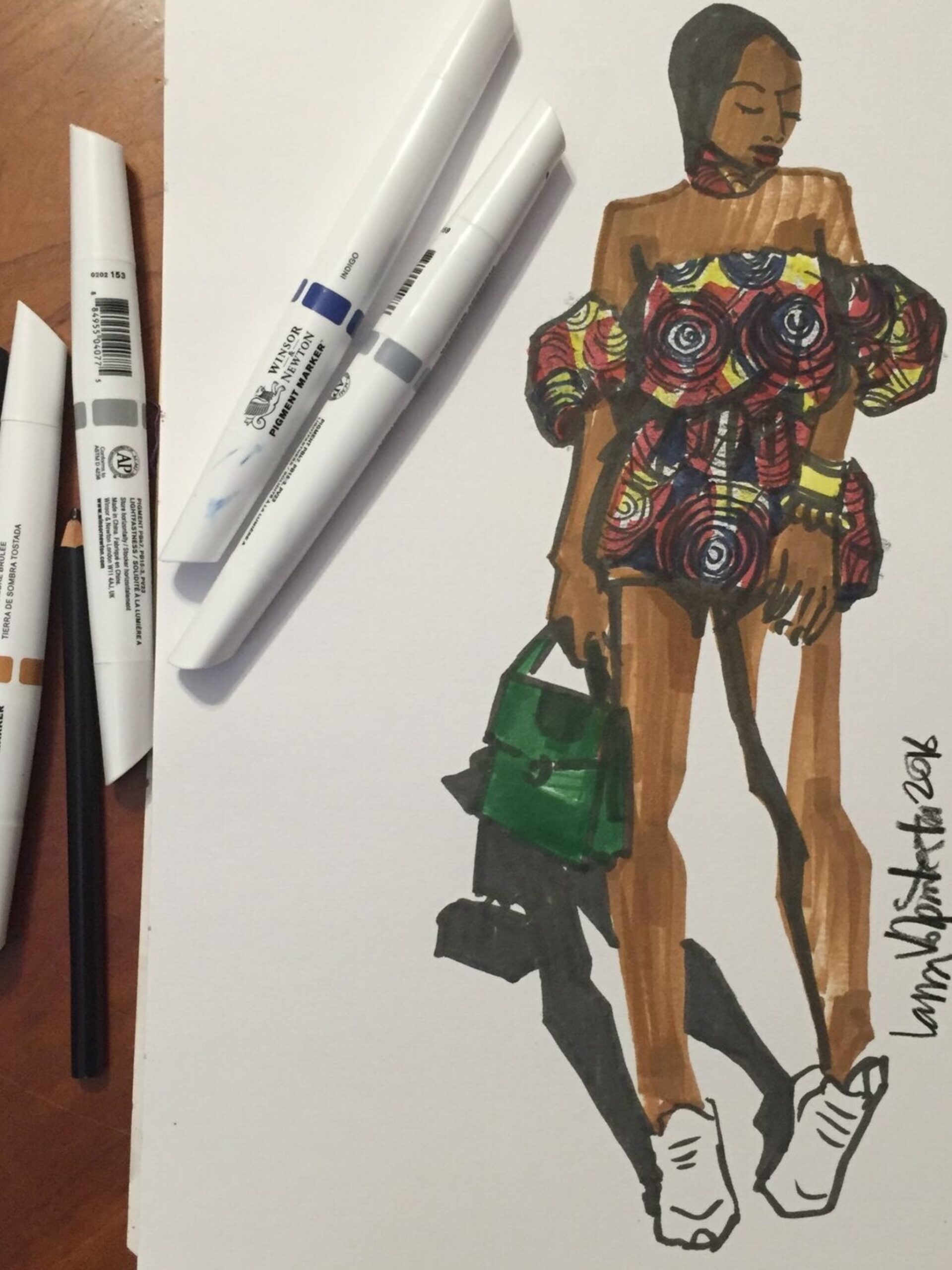
The first chapter of my book “THE LANGUAGE OF FASHION DESIGN: 26 Principles Every Fashion Designer Should Know” on Rockport is ‘COLOR”.
And in there I illustrate and define a lot of the basic vocabulary, such as shades, tints, hues, primaries, secondaries, compliments, and analogous colors. Because for me, color comes first.(I’ve been busy instagramming about color today, so inspired am I.
Monique Lhuillier, a fashion designer I researched for one of the 26 bios in my book, says that when growing up, she and her siblings were not allowed to wear black until they were 18. Amazing! See the power of color, the language of it?
The CULTURE of it?
THE ENERGY OF COLOR
I personally experienced similarly that after my first child was born, I spent a solid 5 years avoiding wearing black before I broke down and started to wear it again. It just didn’t feel even POSSIBLE. That experienced stuck with me.
To wrap up, Marcie Cooperman’s Color Theory Textbook is awesome.
It comes with “Pantone” color chips for study use, and is loaded with images. It truly goes above and beyond the basic truths of color to explain so MANY aspects of design and PERCEPTION.
It’s richly researched and includes equal amounts of art and artifacts by designers and artists as well as images from mother nature herself, which is really cool. It also uses examples architecture, art history, contemporary art, poster and product design to teach concepts.
It is literally an exhaustive text in its 320 loaded pages that is truly a self-study that goes FAR BEYOND the basics of color and gives you a deeply trained eye for DESIGN AND ART, PERIOD!!!
Rounds of applause!
To cut straight to the chase, read chapters 2 and 3 only (that’s color).
Everything beyond brings design into the picture and just goes deeper and deeper. But those first chapters are ESSENTIAL and useful for ANYONE!
Each chapter ALSO includes specific EXERCISES to turn you pro! I love this- like i said,
COLOR IS an EMBODIED EXPERIENCE.
COLOR ISREPRESENTATION
Finally, in the color theory history chapter, you can see that there are no women in the history books, as usual. I guess they were very busy raising and supporting the men who made the history books. So go, Marcie, for making Color History and representing the women :0)
I hope you enjoy these resources. PLEASE SHARE if you have enjoyed this post, and SUBSCRIBE if you never want to miss another post!
Spaces are still open in my premium Soulful Fashion Foundation Immersion Course or SWATCHES TO GOUACHE which is a more concise version of the immersion.
So stay tuned!
Love always,
Laura
ps I can’t help myself!!! UGH!!! Do you know Agatha Luiz de la Prada‘s work? She is SUCH a colorist, takes my breath away, and SO MUCH MORE!
I featured her a lot in my book and this link here is to the “libros” page of her website. You can flip through the pages for free and feel the magic.
It is like a museum trip, I KID YOU NOT.
My students always thank me for sharing this page with them, so here it is. SHE IS SO MUCH MORE THAN A FASHION DESIGNER.
I HOPE YOU ENJOY! SHARE THE LOVE!

After this posting, I got an enthusiastic endorsement from a former student and friend about THIS book. So let’s check it out in a future post!
Until next time,

Author, The Language of Fashion Design: 26 Principles Every Fashion Designer Should Know on Rockport
Assistant Professor of Fashion Design, Parsons School of Design, NYC, since 1997
Singer
Mom
Laura A