ADOBE FRESCO APP FASHION SKETCHING
Every week on Zoom
I host livestream fashion sketching sessions where members (and myself ) can bring whatever art tools and supplies we want.
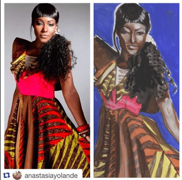
I curate music and figures, poses (1-20 mins) and fashion images of fantastic garments for us to study, practice, explore and sketch from.
TIMELAPSE SHOWS THE simple WORKFLOW
A lot of ipad apps that I actively use (and teach) provide timelapse replays after the process, so you can truly get a feel by watching these— of how I often approach a 5-10 minute fashion sketch as a workflow.
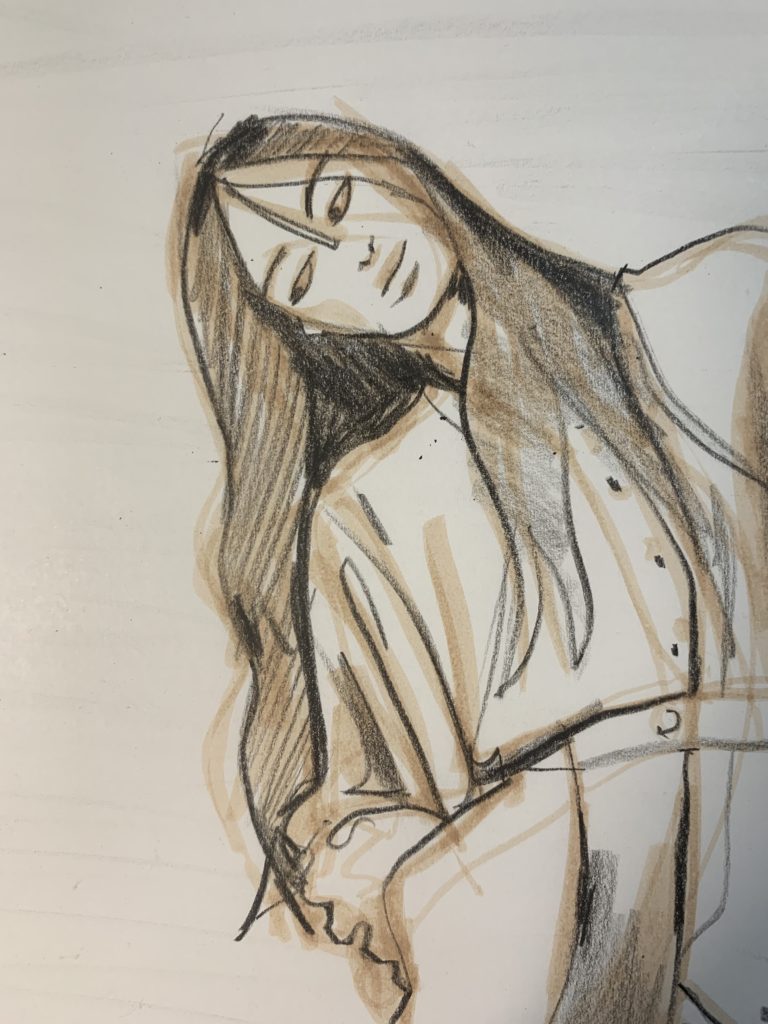
Not always, but very often, I begin with what I call the “undersketch”, a soft “mapping: and gesture process that creates the base of my drawing.
IN THIS SESSION i think it’s important that you know that I only used ONE BRUSH/TOOL inside the Adobe fresco app
USING THE PASTEL TOOL
in this session, I opened the app after a long time not having used it.
I chose the PASTEL tool because it had the soft, crumbly texxture that I love in most soft pencil tools on digital art apps.
In some apps, using the side of my Apple Pencil will give me a soft, WIDE , sheer area of crumbly, organic pencil tone.
But how I worked today:
I chose the pastel tool, and simply used it at a very small size to keep it behaving as a pencil.
KNOW THAT YOU CAN ALWAYS ADJUST THE SIZE OF YOUR BRUSH TIP
a simple slider makes this adjustment.
Since I knew I would want a tool that gave me a range from fine lines to wide areas of tone, PASTEL satisfied that need.
(For example, some pens or pencil tools only go from thick to thin, but within a limited range. But pastel did it all for me, fineline to huge).
BUILDING A FASHION SKETCH IN ANY MEDIUM
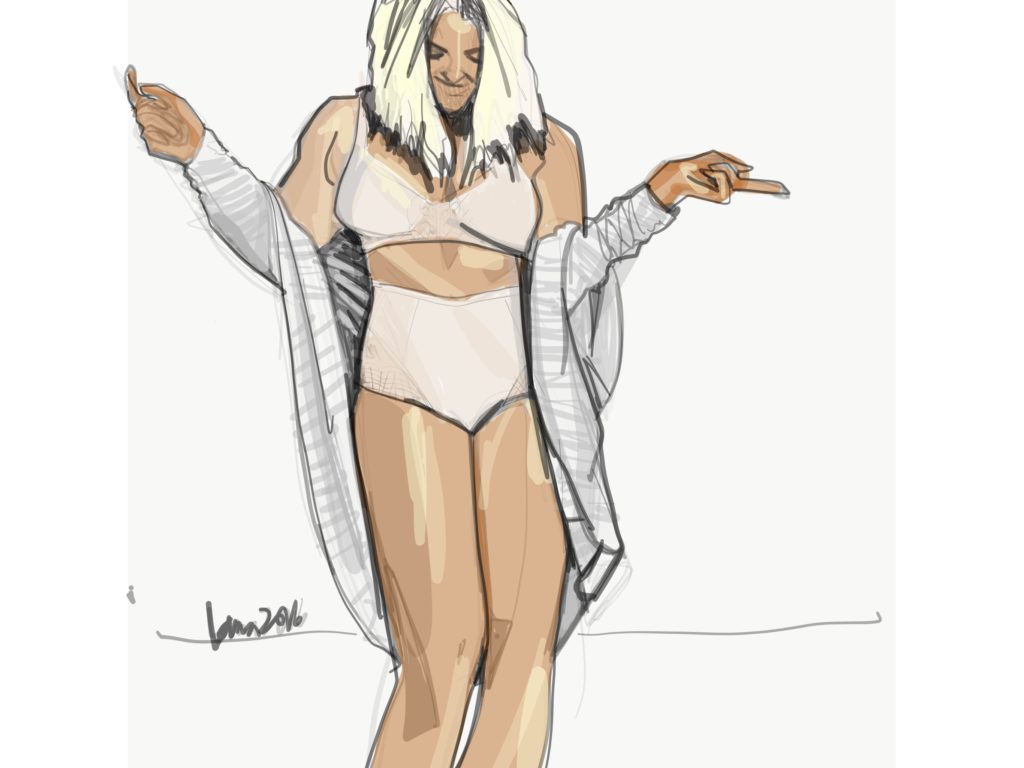
You will ALMOST always see me “whispering” a fashion sketch into existence.
On Adobe Fresco, or any digital art app for mobile devices like ipad, this means two things to me.
LOW OPACITY: (very faint lines so that I can explore my sketch without commitment, and get a feel for it before lines get dark and certain).
LARGE BRUSH: (soft, wide areas of tone help me see the model drawing and feel out the figure as something SOLID rather than skinny, dark lines that distract me to look at the edges of something rather than it’s INNER ESSENCE.)
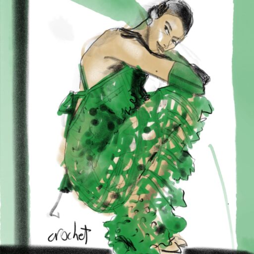
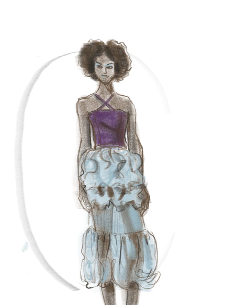
FABRIC OPACITIES, using LAYERS, AND TEXTURES
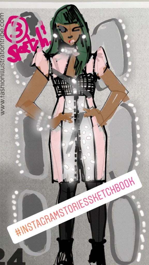
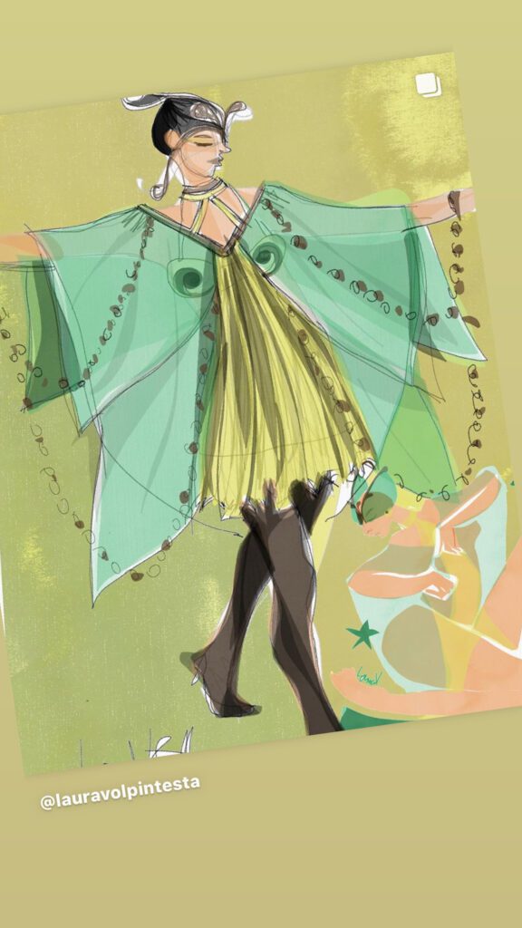
Above, you can see how I built the body first and then layered the sheer, textured fabric over that.
ONE THING I ALMOST ALWAYS DO is apply a tone to the skin before the clothing.
On ipad, I can do the drawing on one layer, and apply colors to the layers BELOW that in order to keep my lines crisp and visible.
At the same time, sometimes I choose to color ON TOP of my drawing in an upper layer, so that the skin is masked or diminished by the fabric according to how sheer or opaque the fabric is.
DIGITAL SHADING METHODS FOR ART APPS
Then I often take the colors I’ve used and “drag” then on the color picker into the grey, toned, darker version of that same color (or else a sheer black brush) in order to add shadows to my fashion sketches.
WHY SHADING IN FASHION SKETCHES?
I generally make a big deal about shading in all of my fashion design, illustration courses.
- Shading helps to direct the eye around the page (creating movement, or to prioritize technical information in the design).
- Shading makes a previously FLAT or stiff-looking drawing flow and pop off the page into 3D reality
- Shading can enhance the textural surface appearance of fabrics.
- Shading techniques can show the high shine, velvety, stiff, or flowy drape of any fabric.
- Shading can add MOVEMENT to a stiff sketch (especially when they sweep across the drawing at a diagonal)
- Shading can visually clarify the separate layers in a fashion look or garment, clarifying openings and overlaps and distinguishing them from just flat seams.
- Shading can show how close or far apart elements are in a sketch or garment (thicker or looser things casting a larger shadow).
BACkGROUNDS
Above and below, using Adobe Fresco, I don’t think I used a separate layer for my background elements.
But I could.
This would give me the freedom to experiment with my finished drawing by creating a separate layer to add frames, signatures, and other elements on or around my fashion sketch and see what impact they have on my composition of the page.
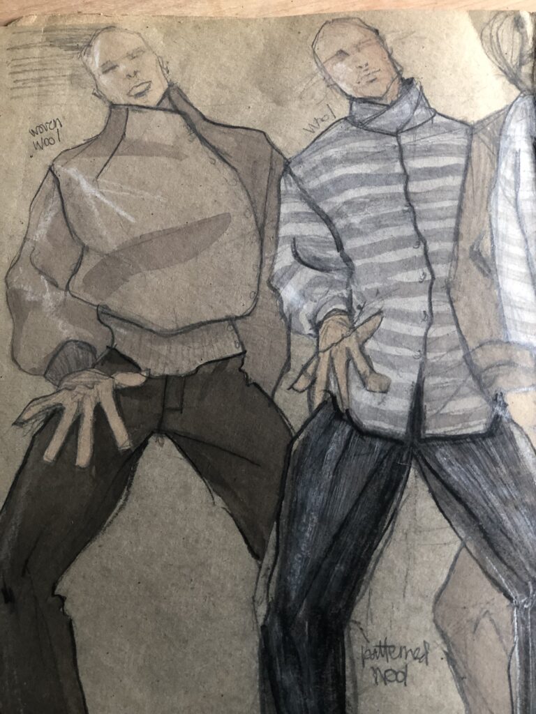
ANALOG ART AND DESIGN CLASSES
I LOVE analog drawing classes because I think the commitment involved in making decisions on a page is a whole necessary and delicious sketching experience in itself (designing the page through composition).
Yet of course, we can play with this using digital apps too, just the stakes aren’t as high because we can usually erase and fix things way more easily in digital fashion drawing, which in some ways, changes the quality of the drawing experience. And I think we can FEEL that from the other side, as observers!
So what do YOU think?
Did you pick up any helpful insights or tips today ?
Did you download the app? (it’s free).
Was playing these timelapse videos insightful?
I’d love to hear from you in the comments below.
OR SEE YOU IN CLASS!
I’ll attach some courses below that deal with the topics we covered to day.
Love,
Laura